
Notification Button for Slint
KitNotificationButton · Slint Kit 0.3.1
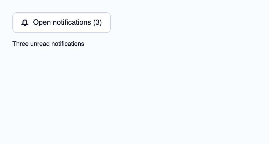
Notification trigger showing an unread-message count.
Try the component
Download the complete project, extract it and run cargo run --locked in its folder. Rust 1.92+; Slint Kit 0.3.0 from crates.io. You can also copy the four files below.
Open notifications to mark this sample’s three notices as read.
ui/app.slint
export { KitFormValidation, HtmlInputKind, NumberInputFormat, KitInputConstraints, KitValidationResult, KitValidityState } from "@kit/kit.slint";
// SPDX-License-Identifier: GPL-3.0-or-later
import { KitNotificationButton, KitTheme, KitThemes } from "@kit/kit.slint";
export component App inherits Window {
    title: "KitNotificationButton example";
    preferred-width: 520px;
    preferred-height: 280px;
    max-width: 100000px;
    max-height: 100000px;
    background: root.theme.canvas;
    in-out property <KitTheme> theme: KitThemes.light;
    in property <int> unread: 3;
    callback open();
    VerticalLayout {
        padding: 24px;
        spacing: 16px;
        alignment: start;
        control := KitNotificationButton { theme: root.theme; label: "Open notifications"; unread-count: root.unread; activated => { root.open(); } }
        result := Text { text: root.unread == 0 ? "Notifications read" : "Three unread notifications"; color: root.theme.text-primary; }
    }

}
src/main.rs
// SPDX-License-Identifier: GPL-3.0-or-later
use slint::ComponentHandle;

mod ui { slint::include_modules!(); }
fn main() -> Result<(), slint::PlatformError> {
    let app = ui::App::new()?;
    slint_kit::init_form_validation!(ui, app);
    let weak = app.as_weak();
    app.on_open(move || { if let Some(app) = weak.upgrade() { app.set_unread(0); } });
    app.run()
}
Cargo.toml and build.rs
Cargo.toml
[package]
name = "slint-kit-notification-button-example"
version = "0.1.0"
edition = "2024"
rust-version = "1.92"
license = "GPL-3.0-or-later"
publish = false

[dependencies]
slint-kit = "=0.3.0"
slint = { version = "=1.18.1", default-features = false, features = ["std", "compat-1-18", "backend-winit", "renderer-skia", "accessibility"] }

[build-dependencies]
slint-kit-build = "=0.3.0"

[workspace]
build.rs
fn main() { slint_kit_build::compile("ui/app.slint").expect("compile component example"); }
Files: Cargo.toml · build.rs · ui/app.slint · src/main.rs
Supply unread-count and a localized label, then handle inherited activated. Connect the action to opening the notification panel or popup.
The computed text and accessible name include the count when positive. The button retains KitPressable interactions and states.
Choose between built-in options and custom composition
Shared options
label— built-in property; custom composition example
Visual composition
The file below produces the screenshot. For controller-driven components, it shows the displayed state without supplying the Rust wiring. Create a project.
Show the screenshot source
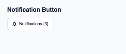
// SPDX-License-Identifier: GPL-3.0-or-later
import { KitNotificationButton, KitTheme, KitThemes } from "@kit/kit.slint";

export component Example inherits Window {
    title: "KitNotificationButton example";
    preferred-width: 420px;
    preferred-height: 180px;
    max-width: 100000px;
    max-height: 100000px;
    background: root.theme.canvas;
    in-out property <KitTheme> theme: KitThemes.light;
    in-out property <string> status;
    VerticalLayout {
        padding: 24px; spacing: 16px; alignment: start;
        Text { text: "Notification Button"; color: root.theme.text-primary; font-size: 20px * root.theme.text-scale; font-weight: 600; }
        KitNotificationButton { theme: root.theme; unread-count: 3; activated => { root.status = "Open notification center"; } }
        if root.status != "": Text { text: root.status; color: root.theme.text-secondary; font-size: 12px * root.theme.text-scale; wrap: word-wrap; }
    }
}
Public API
Inherits KitPressable.
Properties
| Name | Type | Direction |
|---|---|---|
unread-count |
int |
in |
label |
string |
in |
text |
string |
out |
Available inherited properties
| Name | Type | Defined on |
|---|---|---|
theme |
KitTheme |
KitPressable |
intent |
ButtonIntent |
KitPressable |
control-size |
ControlSize |
KitPressable |
control-width |
ControlWidth |
KitPressable |
recipe |
ButtonRecipe |
KitPressable |
accessible-name |
string |
KitPressable |
disabled |
bool |
KitPressable |
busy |
bool |
KitPressable |
tab-stop |
bool |
KitPressable |
hovered |
bool |
KitPressable |
pressed |
bool |
KitPressable |
has-focus |
bool |
KitPressable |
focus-visible |
bool |
KitPressable |