
Range Slider for Slint
KitRangeSlider · Slint Kit 0.3.0
Two-thumb slider for a controlled range.
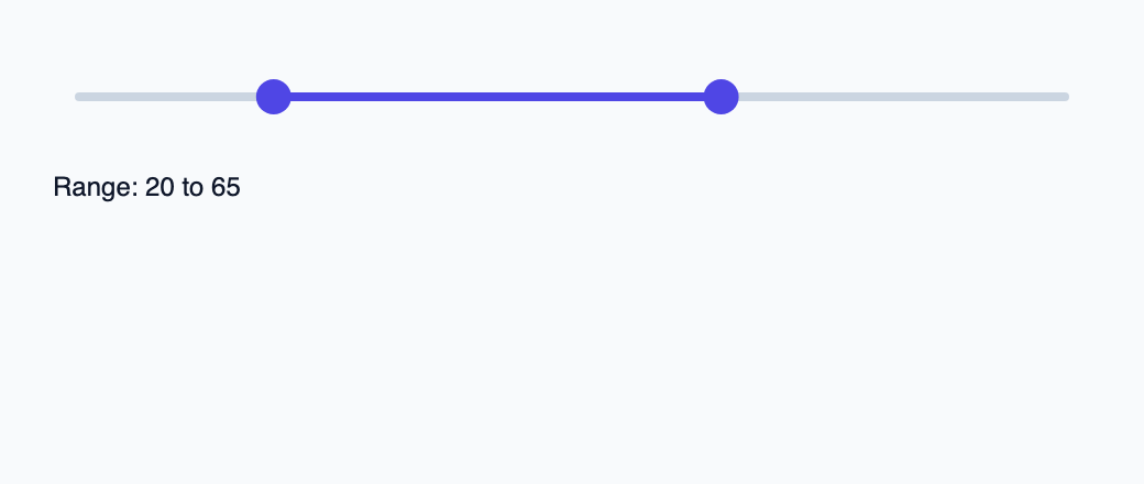
Try the component
Download the complete project, extract it and run cargo run --locked in its folder. Rust 1.92+; Slint Kit 0.3.0 from crates.io. You can also copy the four files below.
Move either thumb or use arrow keys. Rust keeps ordered whole-number endpoints and applies five-point keyboard steps.
ui/app.slint
export { KitFormValidation, HtmlInputKind, NumberInputFormat, KitInputConstraints, KitValidationResult, KitValidityState } from "@kit/kit.slint";
// SPDX-License-Identifier: GPL-3.0-or-later
import { KitRangeSlider, RangeThumb, NavigationStep, KitTheme, KitThemes } from "@kit/kit.slint";
export component App inherits Window {
    title: "KitRangeSlider example";
    preferred-width: 520px;
    preferred-height: 220px;
    max-width: 100000px;
    max-height: 100000px;
    background: root.theme.canvas;
    in-out property <KitTheme> theme: KitThemes.light;
    in property <int> lower;
    in property <int> upper;
    callback position(RangeThumb, float);
    callback navigate(RangeThumb, NavigationStep);
    callback begin();
    callback commit();
    callback cancel();
    VerticalLayout {
        padding: 24px;
        spacing: 16px;
        alignment: start;
        control := KitRangeSlider { theme: root.theme; label: "Allowed range"; lower-position: root.lower * 0.01; upper-position: root.upper * 0.01; lower-label: root.lower + "%"; upper-label: root.upper + "%";
            position-requested(thumb, value) => { root.position(thumb, value); }
            navigate(thumb, step) => { root.navigate(thumb, step); }
            gesture-started(thumb) => { root.begin(); } committed(thumb) => { root.commit(); } cancelled(thumb) => { root.cancel(); }
        }
        result := Text { text: "Range: " + root.lower + " to " + root.upper; color: root.theme.text-primary; }
    }

}
src/main.rs
// SPDX-License-Identifier: GPL-3.0-or-later
use slint::ComponentHandle;
use slint_kit::{RangeController, RangeThumb, DecimalValue, DecimalStep, NumericBounds, OrderedRange, StepDirection};
use std::{cell::RefCell, rc::Rc};
mod ui { slint::include_modules!(); }
fn value(n: i64) -> DecimalValue { DecimalValue::from_integer(n) }
fn thumb(t: ui::RangeThumb) -> RangeThumb { match t { ui::RangeThumb::Lower => RangeThumb::Start, ui::RangeThumb::Upper => RangeThumb::End } }
fn publish(app: &ui::App, range: &RangeController) {
    app.set_lower(range.value().start().to_string().parse().expect("integral percent"));
    app.set_upper(range.value().end().to_string().parse().expect("integral percent"));
}
fn main() -> Result<(), slint::PlatformError> {
    let app = ui::App::new()?;
    slint_kit::init_form_validation!(ui, app);
    let range = Rc::new(RefCell::new(RangeController::new(NumericBounds::new(value(0), value(100)).unwrap(), OrderedRange::new(value(20), value(65)).unwrap(), DecimalStep::new(value(5)).unwrap()).unwrap()));
    publish(&app, &range.borrow());
    let state = range.clone(); let weak = app.as_weak();
    app.on_position(move |t, position| { if !position.is_finite() { return; }
        let quantized = value((position.clamp(0.0, 1.0) * 100.0).round() as i64);
        let _ = state.borrow_mut().set(thumb(t), quantized);
        if let Some(app) = weak.upgrade() { publish(&app, &state.borrow()); }
    });
    let state = range.clone(); let weak = app.as_weak();
    app.on_navigate(move |t, step| {
        let t = thumb(t);
        { let mut range = state.borrow_mut();
          let _ = match step {
            ui::NavigationStep::Next | ui::NavigationStep::PageNext => range.step(t, StepDirection::Increment),
            ui::NavigationStep::Previous | ui::NavigationStep::PagePrevious => range.step(t, StepDirection::Decrement),
            ui::NavigationStep::First => { let v = if t == RangeThumb::Start { value(0) } else { range.value().start() }; range.set(t, v) },
            ui::NavigationStep::Last => { let v = if t == RangeThumb::End { value(100) } else { range.value().end() }; range.set(t, v) },
          };
        }
        if let Some(app) = weak.upgrade() { publish(&app, &state.borrow()); }
    });
    let state = range.clone(); app.on_begin(move || state.borrow_mut().begin_drag());
    let state = range.clone(); app.on_commit(move || state.borrow_mut().commit_drag());
    let weak = app.as_weak(); app.on_cancel(move || { range.borrow_mut().cancel_drag(); if let Some(app) = weak.upgrade() { publish(&app, &range.borrow()); } });
    app.run()
}
Cargo.toml and build.rs
Cargo.toml
[package]
name = "slint-kit-range-slider-example"
version = "0.1.0"
edition = "2024"
rust-version = "1.92"
license = "GPL-3.0-or-later"
publish = false

[dependencies]
slint-kit = "=0.3.0"
slint = { version = "=1.18.1", default-features = false, features = ["std", "compat-1-18", "backend-winit", "renderer-skia", "accessibility"] }

[build-dependencies]
slint-kit-build = "=0.3.0"

[workspace]
build.rs
fn main() { slint_kit_build::compile("ui/app.slint").expect("compile component example"); }
Files: Cargo.toml · build.rs · ui/app.slint · src/main.rs
Project lower-position, upper-position and their labels from a validated range. Handle callbacks with RangeThumb.lower or .upper to preserve thumb identity.
Each thumb has keyboard focus and emits typed navigation steps. The controller enforces endpoint order and restores the range on cancellation.
Choose between built-in options and custom composition
Shared options
label— built-in property; custom composition example
Visual composition
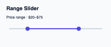
The file below produces the screenshot. For controller-driven components, it shows the displayed state without supplying the Rust wiring. Create a project.
Show the screenshot source
// SPDX-License-Identifier: GPL-3.0-or-later
import { KitRangeSlider, KitTheme, KitThemes } from "@kit/kit.slint";

export component Example inherits Window {
    title: "KitRangeSlider example";
    preferred-width: 420px;
    preferred-height: 180px;
    max-width: 100000px;
    max-height: 100000px;
    background: root.theme.canvas;
    in-out property <KitTheme> theme: KitThemes.light;
    in-out property <string> status;
    VerticalLayout {
        padding: 24px; spacing: 16px; alignment: start;
        Text { text: "Range Slider"; color: root.theme.text-primary; font-size: 20px * root.theme.text-scale; font-weight: 600; }
        Text { text: "Price range · $20–$75"; color: root.theme.text-primary; font-size: 14px * root.theme.text-scale; wrap: word-wrap; } KitRangeSlider { theme: root.theme; label: "Price range"; lower-position: 0.2; upper-position: 0.75; lower-label: "$20"; upper-label: "$75"; }
        if root.status != "": Text { text: root.status; color: root.theme.text-secondary; font-size: 12px * root.theme.text-scale; wrap: word-wrap; }
    }
}
Public API
Inherits Rectangle.
Properties
| Name | Type | Direction |
|---|---|---|
theme |
KitTheme |
in |
access |
FieldAccess |
in |
lower-position |
float |
in |
upper-position |
float |
in |
label |
string |
in |
lower-label |
string |
in |
upper-label |
string |
in |
Types and variants
| Type | Declaration |
|---|---|
enum FieldAccess |
editable, read-only, disabled |
enum NavigationStep |
next, previous, first, last, page-next, page-previous |
enum RangeThumb |
lower, upper |
Callbacks
position-requested(RangeThumb, float)navigate(RangeThumb, NavigationStep)gesture-started(RangeThumb)committed(RangeThumb)cancelled(RangeThumb)
Functions
take-focus()