
Spinner for Slint
KitSpinner · Slint Kit 0.3.1
Indeterminate activity indicator with an accessible label.
Try the component
Download the complete project, extract it and run cargo run --locked in its folder. Rust 1.92+; Slint Kit 0.3.0 from crates.io. You can also copy the four files below.
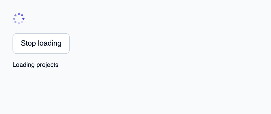
Stop and restart the loading indicator. Reduced-motion themes keep the marks static.
ui/app.slint
export { KitFormValidation, HtmlInputKind, NumberInputFormat, KitInputConstraints, KitValidationResult, KitValidityState } from "@kit/kit.slint";
// SPDX-License-Identifier: GPL-3.0-or-later
import { KitSpinner, KitButton, KitTheme, KitThemes } from "@kit/kit.slint";
export component App inherits Window {
    title: "KitSpinner example";
    preferred-width: 520px;
    preferred-height: 220px;
    max-width: 100000px;
    max-height: 100000px;
    background: root.theme.canvas;
    in-out property <KitTheme> theme: KitThemes.light;
    in property <bool> running: true;
    callback toggle();
    VerticalLayout {
        padding: 24px;
        spacing: 16px;
        alignment: start;
        control := KitSpinner { visible: root.running; theme: root.theme; label: "Loading projects"; running: root.running; }
        KitButton { theme: root.theme; text: root.running ? "Stop loading" : "Start loading"; activated => { root.toggle(); } }
        result := Text { text: root.running ? "Loading projects" : "Loading stopped"; color: root.theme.text-primary; }
    }

}
src/main.rs
// SPDX-License-Identifier: GPL-3.0-or-later
use slint::ComponentHandle;

mod ui { slint::include_modules!(); }
fn main() -> Result<(), slint::PlatformError> {
    let app = ui::App::new()?;
    slint_kit::init_form_validation!(ui, app);
    let weak = app.as_weak();
    app.on_toggle(move || { if let Some(app) = weak.upgrade() { app.set_running(!app.get_running()); } });
    app.run()
}
Cargo.toml and build.rs
Cargo.toml
[package]
name = "slint-kit-spinner-example"
version = "0.1.0"
edition = "2024"
rust-version = "1.92"
license = "GPL-3.0-or-later"
publish = false

[dependencies]
slint-kit = "=0.3.0"
slint = { version = "=1.18.1", default-features = false, features = ["std", "compat-1-18", "backend-winit", "renderer-skia", "accessibility"] }

[build-dependencies]
slint-kit-build = "=0.3.0"

[workspace]
build.rs
fn main() { slint_kit_build::compile("ui/app.slint").expect("compile component example"); }
Files: Cargo.toml · build.rs · ui/app.slint · src/main.rs
Use it while an operation runs without a known fraction and supply a label describing that operation. Drive running from actual activity.
Dots rotate through opacity changes and become static with reduced motion or when stopped. Use KitProgress when measurable progress is available.
Choose between built-in options and custom composition
Shared options
label— built-in property; custom composition example
Visual composition
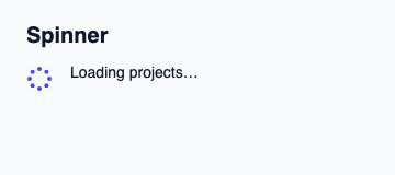
The file below produces the screenshot. For controller-driven components, it shows the displayed state without supplying the Rust wiring. Create a project.
Show the screenshot source
// SPDX-License-Identifier: GPL-3.0-or-later
import { KitSpinner, KitTheme, KitThemes } from "@kit/kit.slint";

export component Example inherits Window {
    title: "KitSpinner example";
    preferred-width: 360px;
    preferred-height: 160px;
    max-width: 100000px;
    max-height: 100000px;
    background: root.theme.canvas;
    in-out property <KitTheme> theme: KitThemes.light;
    in-out property <string> status;
    VerticalLayout {
        padding: 24px; spacing: 16px; alignment: start;
        Text { text: "Spinner"; color: root.theme.text-primary; font-size: 20px * root.theme.text-scale; font-weight: 600; }
        HorizontalLayout { alignment: start; spacing: 16px; KitSpinner { theme: root.theme; running: false; label: "Loading projects"; } Text { text: "Loading projects…"; color: root.theme.text-primary; font-size: 14px * root.theme.text-scale; wrap: word-wrap; } }
        if root.status != "": Text { text: root.status; color: root.theme.text-secondary; font-size: 12px * root.theme.text-scale; wrap: word-wrap; }
    }
}
Public API
Inherits Rectangle.
Properties
| Name | Type | Direction |
|---|---|---|
theme |
KitTheme |
in |
label |
string |
in |
running |
bool |
in |