
Hero for Slint
KitHero · Slint Kit 0.3.1
Prominent introduction block with heading, description and free content.
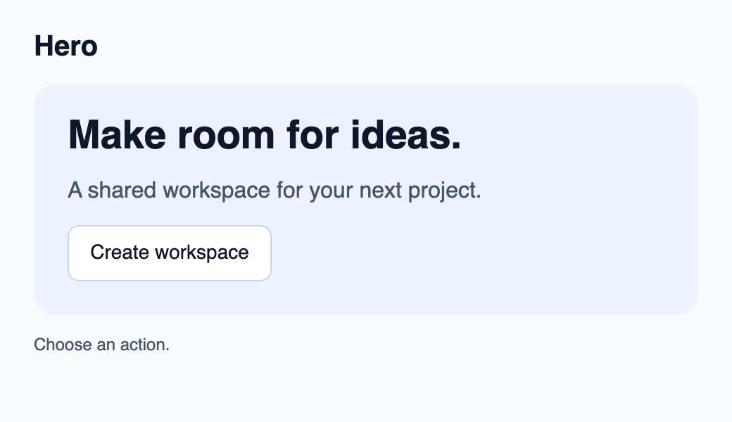
Try the component
Download the complete project, extract it and run cargo run --locked in its folder. Rust 1.92+; Slint Kit 0.3.0 from crates.io. You can also copy the four files below.
Click Create workspace: Rust handles the command and updates the action count.
ui/app.slint
export { KitFormValidation, HtmlInputKind, NumberInputFormat, KitInputConstraints, KitValidationResult, KitValidityState } from "@kit/kit.slint";
// SPDX-License-Identifier: GPL-3.0-or-later
import { KitButton, KitHero, KitTheme, KitThemes } from "@kit/kit.slint";

export enum DemoAction { create-workspace }

export component App inherits Window {
    title: "KitHero example";
    preferred-width: 520px;
    preferred-height: 300px;
    max-width: 100000px;
    max-height: 100000px;
    background: root.theme.canvas;
    in-out property <KitTheme> theme: KitThemes.light;
    in property <string> status: "Choose an action.";
    callback action-requested(DemoAction);
    VerticalLayout {
        padding: 24px; spacing: 16px; alignment: start;
        Text { text: "Hero"; color: root.theme.text-primary; font-size: 20px * root.theme.text-scale; font-weight: 600; }
        KitHero { theme: root.theme; title: "Make room for ideas."; description: "A shared workspace for your next project."; KitButton { theme: root.theme; text: "Create workspace"; activated => { root.action-requested(DemoAction.create-workspace); } } }
        Text { text: root.status; color: root.theme.text-secondary; wrap: word-wrap; }
    }
}
src/main.rs
// SPDX-License-Identifier: GPL-3.0-or-later
use slint::ComponentHandle;
use std::cell::Cell;
slint::include_modules!();

fn main() -> Result<(), slint::PlatformError> {
    let app = App::new()?;
    slint_kit::init_form_validation!(self, app);
    let count = Cell::new(0_u32);
    let weak = app.as_weak();
    app.on_action_requested(move |action| {
        if let Some(app) = weak.upgrade() {
            let next = count.get().checked_add(1).expect("action count capacity");
            count.set(next);
            let label = match action {
                DemoAction::CreateWorkspace => "Create workspace",
            };
            app.set_status(format!("{label} handled by Rust ({next})").into());
        }
    });
    app.run()
}
Cargo.toml and build.rs
Cargo.toml
[package]
name = "slint-kit-hero-example"
version = "0.1.0"
edition = "2024"
rust-version = "1.92"
license = "GPL-3.0-or-later"
publish = false

[dependencies]
slint-kit = "=0.3.0"
slint = { version = "=1.18.1", default-features = false, features = ["std", "compat-1-18", "backend-winit", "renderer-skia", "accessibility"] }

[build-dependencies]
slint-kit-build = "=0.3.0"

[workspace]
build.rs
fn main() {
    slint_kit_build::compile("ui/app.slint").expect("compile component example");
}
Files: Cargo.toml · build.rs · ui/app.slint · src/main.rs
Set title and description, then add an action or supporting content as children. Adjust inset and gap with LayoutSpace.
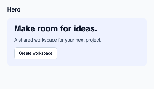
The heading uses larger typography and text wraps. The component owns its background and rounded corners while retaining natural height.
Choose between built-in options and custom composition
Shared options
description— built-in property; custom composition example
Visual composition
The file below produces the screenshot. For controller-driven components, it shows the displayed state without supplying the Rust wiring. Create a project.
Show the screenshot source
// SPDX-License-Identifier: GPL-3.0-or-later
import { KitButton, KitHero, KitTheme, KitThemes } from "@kit/kit.slint";

export component Example inherits Window {
    title: "KitHero example";
    preferred-width: 520px;
    preferred-height: 300px;
    max-width: 100000px;
    max-height: 100000px;
    background: root.theme.canvas;
    in-out property <KitTheme> theme: KitThemes.light;
    in-out property <string> status;
    VerticalLayout {
        padding: 24px; spacing: 16px; alignment: start;
        Text { text: "Hero"; color: root.theme.text-primary; font-size: 20px * root.theme.text-scale; font-weight: 600; }
        KitHero { theme: root.theme; title: "Make room for ideas."; description: "A shared workspace for your next project."; KitButton { theme: root.theme; text: "Create workspace"; activated => { root.status = "Action requested"; } } }
        if root.status != "": Text { text: root.status; color: root.theme.text-secondary; font-size: 12px * root.theme.text-scale; wrap: word-wrap; }
    }
}
Public API
Inherits Rectangle.
Properties
| Name | Type | Direction |
|---|---|---|
theme |
KitTheme |
in |
title |
string |
in |
description |
string |
in |
inset |
LayoutSpace |
in |
gap |
LayoutSpace |
in |
Types and variants
| Type | Declaration |
|---|---|
enum LayoutSpace |
none, tight, compact, regular, roomy, section |