
Bouton de notifications pour Slint
KitNotificationButton · Slint Kit 0.3.1
Déclencheur de notifications avec nombre de messages non lus.
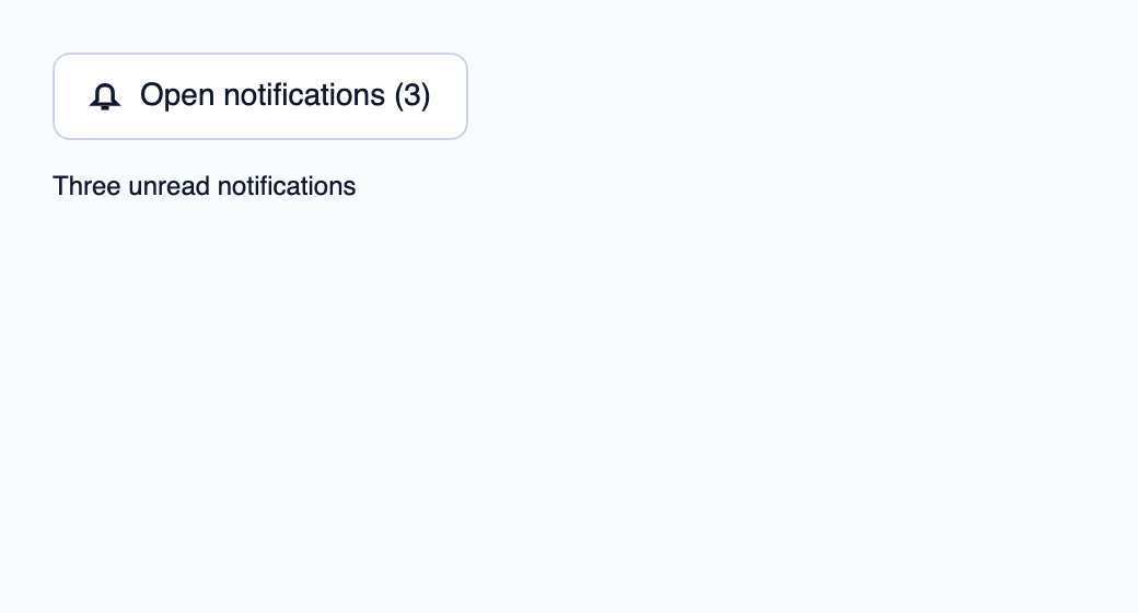
Essayer le composant
Télécharger le projet complet, le décompresser et lancer cargo run --locked dans son dossier. Rust 1.92+ ; Slint Kit 0.3.0 depuis crates.io. Vous pouvez aussi copier les quatre fichiers ci-dessous.
Ouvrez les notifications pour marquer les trois avis de cet exemple comme lus.
ui/app.slint
export { KitFormValidation, HtmlInputKind, NumberInputFormat, KitInputConstraints, KitValidationResult, KitValidityState } from "@kit/kit.slint";
// SPDX-License-Identifier: GPL-3.0-or-later
import { KitNotificationButton, KitTheme, KitThemes } from "@kit/kit.slint";
export component App inherits Window {
    title: "KitNotificationButton example";
    preferred-width: 520px;
    preferred-height: 280px;
    max-width: 100000px;
    max-height: 100000px;
    background: root.theme.canvas;
    in-out property <KitTheme> theme: KitThemes.light;
    in property <int> unread: 3;
    callback open();
    VerticalLayout {
        padding: 24px;
        spacing: 16px;
        alignment: start;
        control := KitNotificationButton { theme: root.theme; label: "Open notifications"; unread-count: root.unread; activated => { root.open(); } }
        result := Text { text: root.unread == 0 ? "Notifications read" : "Three unread notifications"; color: root.theme.text-primary; }
    }

}
src/main.rs
// SPDX-License-Identifier: GPL-3.0-or-later
use slint::ComponentHandle;

mod ui { slint::include_modules!(); }
fn main() -> Result<(), slint::PlatformError> {
    let app = ui::App::new()?;
    slint_kit::init_form_validation!(ui, app);
    let weak = app.as_weak();
    app.on_open(move || { if let Some(app) = weak.upgrade() { app.set_unread(0); } });
    app.run()
}
Cargo.toml et build.rs
Cargo.toml
[package]
name = "slint-kit-notification-button-example"
version = "0.1.0"
edition = "2024"
rust-version = "1.92"
license = "GPL-3.0-or-later"
publish = false

[dependencies]
slint-kit = "=0.3.0"
slint = { version = "=1.18.1", default-features = false, features = ["std", "compat-1-18", "backend-winit", "renderer-skia", "accessibility"] }

[build-dependencies]
slint-kit-build = "=0.3.0"

[workspace]
build.rs
fn main() { slint_kit_build::compile("ui/app.slint").expect("compile component example"); }
Fichiers : Cargo.toml · build.rs · ui/app.slint · src/main.rs
Fournissez unread-count et un label localisé, puis traitez le callback hérité activated. Reliez l’action à l’ouverture du panneau ou de la popup de notifications.
Le texte calculé et le nom accessible incluent le compte lorsqu’il est positif. Le bouton garde les interactions et états de KitPressable.
Choisir entre une option intégrée et une composition personnalisée
Options partagées
label— propriété intégrée ; exemple de composition personnalisé
Composition visuelle
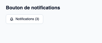
Le fichier ci-dessous produit la capture. Pour les composants pilotés par un contrôleur, il montre l’état affiché sans fournir le branchement Rust. Créer un projet.
Afficher le fichier de la capture
// Public label overrides localize this fixture; toolkit/host defaults keep their language.
// SPDX-License-Identifier: GPL-3.0-or-later
import { KitNotificationButton, KitTheme, KitThemes } from "@kit/kit.slint";

export component Example inherits Window {
    title: "KitNotificationButton — exemple";
    preferred-width: 420px;
    preferred-height: 180px;
    max-width: 100000px;
    max-height: 100000px;
    background: root.theme.canvas;
    in-out property <KitTheme> theme: KitThemes.light;
    in-out property <string> status;
    VerticalLayout {
        padding: 24px; spacing: 16px; alignment: start;
        Text { text: "Bouton de notifications"; color: root.theme.text-primary; font-size: 20px * root.theme.text-scale; font-weight: 600; }
        KitNotificationButton { label: "Notifications"; theme: root.theme; unread-count: 3; activated => { root.status = "Ouvrir le centre de notifications"; } }
        if root.status != "": Text { text: root.status; color: root.theme.text-secondary; font-size: 12px * root.theme.text-scale; wrap: word-wrap; }
    }
}
API publique
Hérite de KitPressable.
Propriétés
| Nom | Type | Sens |
|---|---|---|
unread-count |
int |
in |
label |
string |
in |
text |
string |
out |
Propriétés héritées disponibles
| Nom | Type | Définie sur |
|---|---|---|
theme |
KitTheme |
KitPressable |
intent |
ButtonIntent |
KitPressable |
control-size |
ControlSize |
KitPressable |
control-width |
ControlWidth |
KitPressable |
recipe |
ButtonRecipe |
KitPressable |
accessible-name |
string |
KitPressable |
disabled |
bool |
KitPressable |
busy |
bool |
KitPressable |
tab-stop |
bool |
KitPressable |
hovered |
bool |
KitPressable |
pressed |
bool |
KitPressable |
has-focus |
bool |
KitPressable |
focus-visible |
bool |
KitPressable |