
Accordion for Slint
KitAccordion · Slint Kit 0.3.0
Set of disclosure sections driven by stable identities.
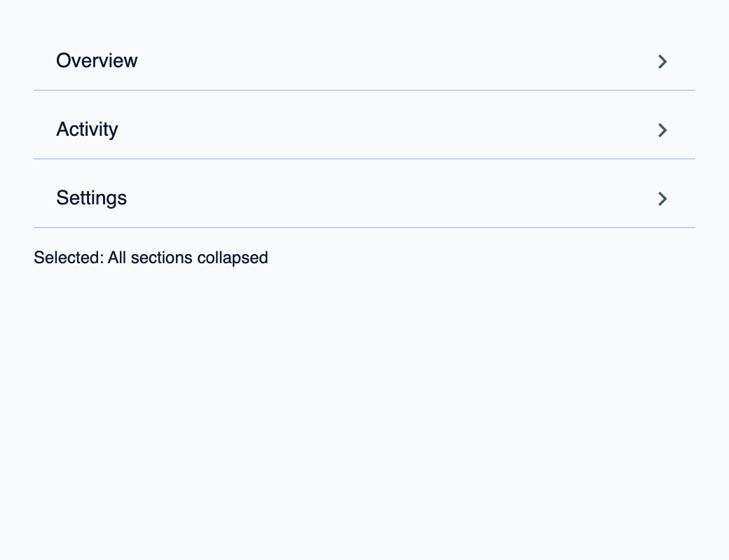
Try the component
Download the complete project, extract it and run cargo run --locked in its folder. Rust 1.92+; Slint Kit 0.3.0 from crates.io. You can also copy the four files below.
Open Activity, then Settings. Rust keeps only the selected disclosure expanded.
ui/app.slint
export { KitFormValidation, HtmlInputKind, NumberInputFormat, KitInputConstraints, KitValidationResult, KitValidityState } from "@kit/kit.slint";
// SPDX-License-Identifier: GPL-3.0-or-later
import { KitAccordion, DisclosureRow, ExpansionMode, OptionRow, SelectState, NavigationStep, CloseReason, SelectionAvailability, KitTheme, KitThemes } from "@kit/kit.slint";
export component App inherits Window {
    title: "KitAccordion example";
    preferred-width: 520px;
    preferred-height: 400px;
    max-width: 100000px;
    max-height: 100000px;
    background: root.theme.canvas;
    in-out property <KitTheme> theme: KitThemes.light;
    in property <[OptionRow]> rows;
    in property <SelectState> select-state;
    in property <string> selected-label: "Overview";
    in-out property <string> query;
    callback select-open();
    callback select-navigate(NavigationStep);
    callback select-activate(int, int);
    callback select-dismiss(CloseReason);
    callback select-query(string);
    callback select-typeahead(string);
    in property <[DisclosureRow]> disclosures;
    callback expand(int, int, bool, ExpansionMode);
    VerticalLayout {
        padding: 24px;
        spacing: 16px;
        alignment: start;
        control := KitAccordion {
            theme: root.theme; rows: root.disclosures; state: root.select-state; mode: ExpansionMode.single;
            navigate(step) => { root.select-navigate(step); }
            expansion-requested(token, generation, expanded, mode) => { root.expand(token, generation, expanded, mode); }
        }
        result := Text { text: "Selected: " + root.selected-label; color: root.theme.text-primary; }
    }

}
src/main.rs
// SPDX-License-Identifier: GPL-3.0-or-later
use slint::ComponentHandle;
use slint_kit::{Ownership, SelectOption, SelectionIntent};
#[derive(Clone, Copy, PartialEq, Eq, Hash)]
enum Destination { Overview, Activity, Settings }
impl Destination {
    fn label(self) -> &'static str {
        match self { Self::Overview => "Overview", Self::Activity => "Activity", Self::Settings => "Settings" }
    }
}

mod ui { slint::include_modules!(); }
fn main() -> Result<(), slint::PlatformError> {
    let app = ui::App::new()?;
    slint_kit::init_form_validation!(ui, app);
    let selection = slint_kit::bind_select!(ui, app, vec![
        SelectOption::new(Destination::Overview, "Overview"),
        SelectOption::new(Destination::Activity, "Activity"),
        SelectOption::new(Destination::Settings, "Settings"),
    ], Some(Destination::Overview), Ownership::Local);
    let weak = app.as_weak();
    selection.on_intent(move |intent| {
        if let Some(app) = weak.upgrade() {
            app.set_selected_label(match intent {
                SelectionIntent::Commit(key) => key.label(),
                SelectionIntent::Clear => "No selection",
            }.into());
        }
    });
    selection.open();
    fn publish(app: &ui::App, expanded: Option<Destination>) {
        use slint::Model;
        let rows = app.get_rows().iter().map(|item| {
            let key = match item.token { 0 => Some(Destination::Overview), 1 => Some(Destination::Activity), 2 => Some(Destination::Settings), _ => None };
            ui::DisclosureRow { item: ui::OptionRow { description: "Details for this project section.".into(), ..item }, expanded: key.is_some() && key == expanded }
        }).collect::<Vec<_>>();
        app.set_disclosures(slint::ModelRc::new(slint::VecModel::from(rows)));
        app.set_selected_label(expanded.map_or("All sections collapsed", Destination::label).into());
    }
    publish(&app, None);
    let weak = app.as_weak();
    app.on_expand(move |token, generation, expanded, _mode| {
        if let Some(app) = weak.upgrade() {
            if generation != app.get_select_state().generation { return; }
            let key = match token { 0 => Some(Destination::Overview), 1 => Some(Destination::Activity), 2 => Some(Destination::Settings), _ => None };
            if key.is_some() { publish(&app, if expanded { key } else { None }); }
        }
    });
    app.run()
}
Cargo.toml and build.rs
Cargo.toml
[package]
name = "slint-kit-accordion-example"
version = "0.1.0"
edition = "2024"
rust-version = "1.92"
license = "GPL-3.0-or-later"
publish = false

[dependencies]
slint-kit = "=0.3.0"
slint = { version = "=1.18.1", default-features = false, features = ["std", "compat-1-18", "backend-winit", "renderer-skia", "accessibility"] }

[build-dependencies]
slint-kit-build = "=0.3.0"

[workspace]
build.rs
fn main() { slint_kit_build::compile("ui/app.slint").expect("compile component example"); }
Files: Cargo.toml · build.rs · ui/app.slint · src/main.rs
Supply DisclosureRow values and state, then handle expansion-requested(token, generation, expanded, mode). Choose ExpansionMode.single, the default, or .multiple.
The controller applies expansion policy and header navigation. Answers use row.item.description, and transitions respect reduced motion.
Visual composition
The file below produces the screenshot. For controller-driven components, it shows the displayed state without supplying the Rust wiring. Create a project.
Show the screenshot source
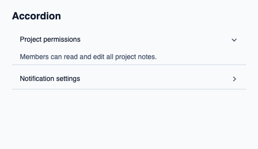
// SPDX-License-Identifier: GPL-3.0-or-later
import { KitAccordion, KitTheme, KitThemes, SelectionAvailability } from "@kit/kit.slint";

export component Example inherits Window {
    title: "KitAccordion example";
    preferred-width: 520px;
    preferred-height: 300px;
    max-width: 100000px;
    max-height: 100000px;
    background: root.theme.canvas;
    in-out property <KitTheme> theme: KitThemes.light;
    in-out property <string> status;
    VerticalLayout {
        padding: 24px; spacing: 16px; alignment: start;
        Text { text: "Accordion"; color: root.theme.text-primary; font-size: 20px * root.theme.text-scale; font-weight: 600; }
        KitAccordion { theme: root.theme; rows: [{ item: { token: 11, generation: 1, label: "Project permissions", description: "Members can read and edit all project notes.", disabled: false }, expanded: true }, { item: { token: 23, generation: 1, label: "Notification settings", description: "Choose how you receive updates.", disabled: false }, expanded: false }]; state: { open: false, generation: 1, active-index: 0, active: { present: true, token: 11 }, selected: { present: true, token: 11 }, selection-availability: SelectionAvailability.available }; }
        if root.status != "": Text { text: root.status; color: root.theme.text-secondary; font-size: 12px * root.theme.text-scale; wrap: word-wrap; }
    }
}
Public API
Inherits VerticalLayout.
Properties
| Name | Type | Direction |
|---|---|---|
theme |
KitTheme |
in |
control-size |
ControlSize |
in |
rows |
[DisclosureRow] |
in |
state |
SelectState |
in |
mode |
ExpansionMode |
in |
Types and variants
| Type | Declaration |
|---|---|
enum ControlSize |
compact, medium, comfortable |
struct DisclosureRow |
item: OptionRow, expanded: bool |
enum ExpansionMode |
single, multiple |
enum NavigationStep |
next, previous, first, last, page-next, page-previous |
struct OptionRow |
token: int, generation: int, label: string, description: string, disabled: bool |
enum SelectionAvailability |
absent, available, unavailable |
struct SelectionRef |
present: bool, token: int |
struct SelectState |
selection-availability: SelectionAvailability, selected: SelectionRef, active: SelectionRef, open: bool, active-index: int, generation: int |
Callbacks
expansion-requested(int, int, bool, ExpansionMode)navigate(NavigationStep)