
Progress for Slint
KitProgress · Slint Kit 0.3.0
Determinate progress bar expressed as a fraction.
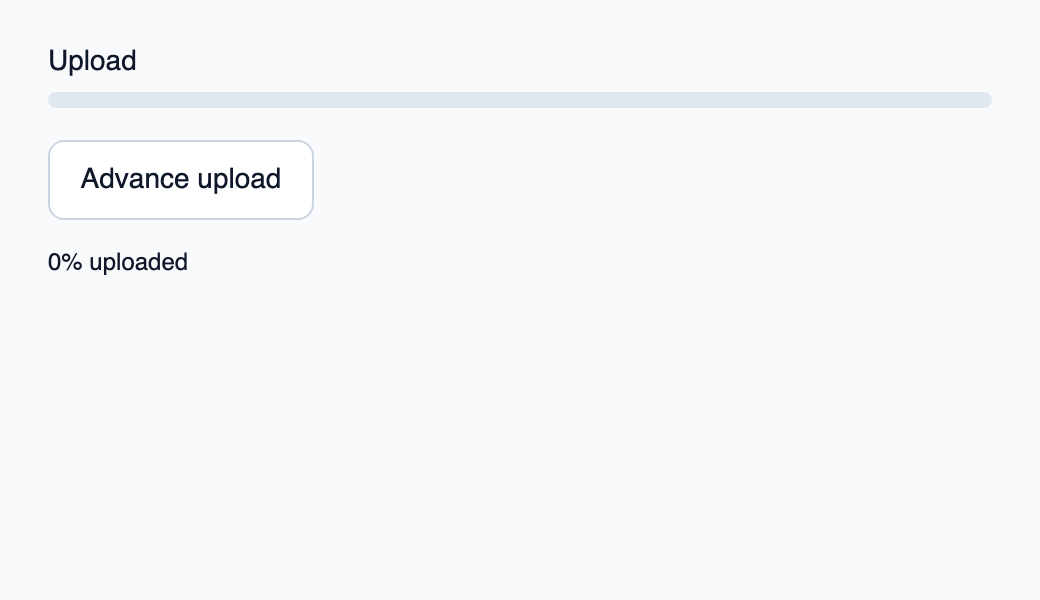
Try the component
Download the complete project, extract it and run cargo run --locked in its folder. Rust 1.92+; Slint Kit 0.3.0 from crates.io. You can also copy the four files below.
Advance upload in 25% steps; Rust publishes a bounded progress value.
ui/app.slint
export { KitFormValidation, HtmlInputKind, NumberInputFormat, KitInputConstraints, KitValidationResult, KitValidityState } from "@kit/kit.slint";
// SPDX-License-Identifier: GPL-3.0-or-later
import { KitProgress, KitButton, KitTheme, KitThemes } from "@kit/kit.slint";
export component App inherits Window {
    title: "KitProgress example";
    preferred-width: 520px;
    preferred-height: 300px;
    max-width: 100000px;
    max-height: 100000px;
    background: root.theme.canvas;
    in-out property <KitTheme> theme: KitThemes.light;
    in property <int> percent;
    callback advance();
    VerticalLayout {
        padding: 24px;
        spacing: 16px;
        alignment: start;
        control := KitProgress { theme: root.theme; label: "Upload"; value: root.percent / 100; }
        KitButton { theme: root.theme; text: "Advance upload"; activated => { root.advance(); } }
        result := Text { text: root.percent + "% uploaded"; color: root.theme.text-primary; }
    }

}
src/main.rs
// SPDX-License-Identifier: GPL-3.0-or-later
use slint::ComponentHandle;

mod ui { slint::include_modules!(); }
fn main() -> Result<(), slint::PlatformError> {
    let app = ui::App::new()?;
    slint_kit::init_form_validation!(ui, app);
    let weak = app.as_weak();
    app.on_advance(move || { if let Some(app) = weak.upgrade() { app.set_percent((app.get_percent() + 25).min(100)); } });
    app.run()
}
Cargo.toml and build.rs
Cargo.toml
[package]
name = "slint-kit-progress-example"
version = "0.1.0"
edition = "2024"
rust-version = "1.92"
license = "GPL-3.0-or-later"
publish = false

[dependencies]
slint-kit = "=0.3.0"
slint = { version = "=1.18.1", default-features = false, features = ["std", "compat-1-18", "backend-winit", "renderer-skia", "accessibility"] }

[build-dependencies]
slint-kit-build = "=0.3.0"

[workspace]
build.rs
fn main() { slint_kit_build::compile("ui/app.slint").expect("compile component example"); }
Files: Cargo.toml · build.rs · ui/app.slint · src/main.rs
Project progress through value from 0 to 1 and supply a contextual label. Keep exact counters and fraction calculation in the controller.
bounded-value clamps rendering to the interval and the accessible percentage is rounded. The component neither animates invented progress nor manages the task.
Choose between built-in options and custom composition
Shared options
label— built-in property; custom composition example
Visual composition
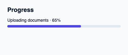
The file below produces the screenshot. For controller-driven components, it shows the displayed state without supplying the Rust wiring. Create a project.
Show the screenshot source
// SPDX-License-Identifier: GPL-3.0-or-later
import { KitProgress, KitTheme, KitThemes } from "@kit/kit.slint";

export component Example inherits Window {
    title: "KitProgress example";
    preferred-width: 420px;
    preferred-height: 180px;
    max-width: 100000px;
    max-height: 100000px;
    background: root.theme.canvas;
    in-out property <KitTheme> theme: KitThemes.light;
    in-out property <string> status;
    VerticalLayout {
        padding: 24px; spacing: 16px; alignment: start;
        Text { text: "Progress"; color: root.theme.text-primary; font-size: 20px * root.theme.text-scale; font-weight: 600; }
        KitProgress { theme: root.theme; label: "Uploading documents · 65%"; value: 0.65; }
        if root.status != "": Text { text: root.status; color: root.theme.text-secondary; font-size: 12px * root.theme.text-scale; wrap: word-wrap; }
    }
}
Public API
Inherits VerticalLayout.
Properties
| Name | Type | Direction |
|---|---|---|
theme |
KitTheme |
in |
value |
float |
in |
label |
string |
in |
bounded-value |
float |
out |