
Color Field for Slint
KitColorField · Slint Kit 0.3.0
Hex text input with a color swatch and picker popup.
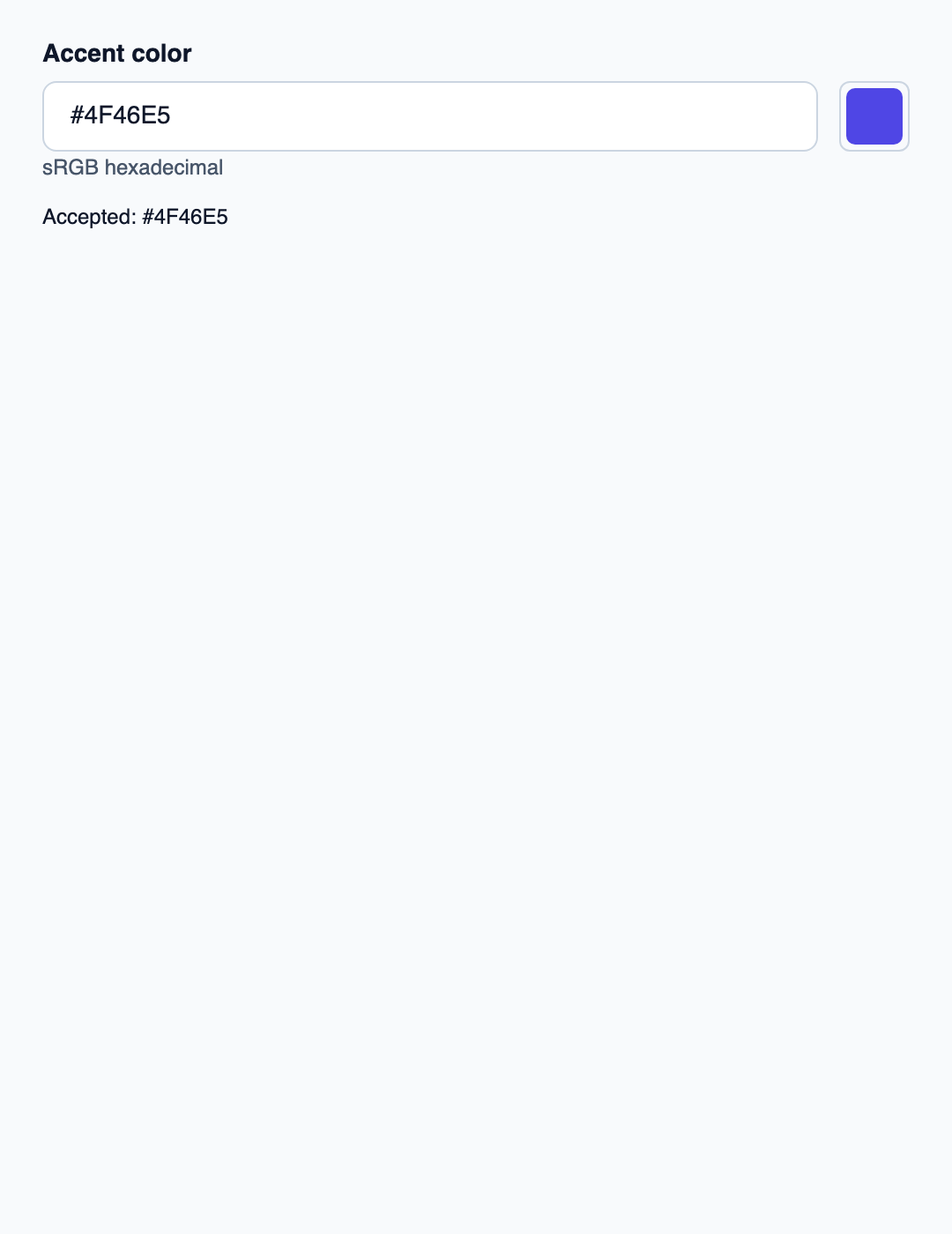
Try the component
Download the complete project, extract it and run cargo run --locked in its folder. Rust 1.92+; Slint Kit 0.3.0 from crates.io. You can also copy the four files below.
Edit a hexadecimal sRGB color or use the picker. Rust validates byte channels, keeps drafts separate and publishes the accepted color.
ui/app.slint
export { KitFormValidation, HtmlInputKind, NumberInputFormat, KitInputConstraints, KitValidationResult, KitValidityState } from "@kit/kit.slint";
import {KitColorField,KitThemes,SrgbColorView,ColorChannel,NavigationStep} from "@kit/kit.slint";
export {SrgbColorView,ColorChannel,NavigationStep}
export component App inherits Window {
 title:"color-field";preferred-width:540px;preferred-height:700px;max-width:100000px;max-height:100000px;background:KitThemes.light.canvas;
 in-out property <string> hex;in property <string> error;in property <string> accepted;in property <SrgbColorView> color-value;in property <color> swatch;
 callback commit(string);callback edit();callback choose(SrgbColorView);callback cancel();
 VerticalLayout{padding:24px;spacing:16px;alignment:start;
 control:=KitColorField{label:"Accent color";accepted-color:root.color-value;swatch:root.swatch;color-requested(value)=>{root.choose(value);}text<=>root.hex;error:root.error;edited(value)=>{root.edit();}commit-requested(value)=>{root.commit(value);}cancelled=>{root.cancel();}}
 Text{text:"Accepted: "+root.accepted;color:KitThemes.light.text-primary;wrap:word-wrap;}
 }
}
src/main.rs
use slint::ComponentHandle;
use slint_kit::{AlphaPolicy, DraftValue, SrgbColor};
use std::{cell::RefCell, rc::Rc};
mod ui {
    slint::include_modules!();
}
fn publish(app: &ui::App, color: SrgbColor, accepted: bool) {
    app.set_hex(color.hex(AlphaPolicy::Opaque).into());
    app.set_color_value(ui::SrgbColorView {
        red: color.red.into(),
        green: color.green.into(),
        blue: color.blue.into(),
        alpha: 255,
    });
    app.set_swatch(slint::Color::from_rgb_u8(
        color.red,
        color.green,
        color.blue,
    ));
    if accepted {
        app.set_accepted(color.hex(AlphaPolicy::Opaque).into());
    }
}
fn main() -> Result<(), slint::PlatformError> {
    let app = ui::App::new()?;
    slint_kit::init_form_validation!(ui, app);
    let initial = SrgbColor {
        red: 79,
        green: 70,
        blue: 229,
        alpha: 255,
    };
    let state = Rc::new(RefCell::new((initial, initial)));
    publish(&app, initial, true);
    let weak = app.as_weak();
    let shared = state.clone();
    app.on_commit(move |text| {
        if let Some(app) = weak.upgrade() {
            match SrgbColor::parse_hex(&text, AlphaPolicy::Opaque) {
                DraftValue::Parsed(value) => {
                    *shared.borrow_mut() = (value, value);
                    publish(&app, value, true);
                    app.set_error("".into());
                }
                _ => app.set_error("Use #RRGGBB or #RGB hexadecimal".into()),
            }
        }
    });
    let weak = app.as_weak();
    app.on_edit(move || {
        if let Some(app) = weak.upgrade() {
            app.set_error("".into());
        }
    });
    let weak = app.as_weak();
    let shared = state.clone();
    app.on_choose(move |view| {
        if let Some(app) = weak.upgrade() {
            if let (Ok(red), Ok(green), Ok(blue)) = (
                view.red.try_into(),
                view.green.try_into(),
                view.blue.try_into(),
            ) {
                let color = SrgbColor {
                    red,
                    green,
                    blue,
                    alpha: 255,
                };
                *shared.borrow_mut() = (color, color);
                publish(&app, color, true);
                app.set_error("".into());
            }
        }
    });
    let weak = app.as_weak();
    let shared = state.clone();
    app.on_cancel(move || {
        if let Some(app) = weak.upgrade() {
            let color = shared.borrow().0;
            publish(&app, color, true);
            app.set_error("".into());
        }
    });

    app.run()
}
Cargo.toml and build.rs
Cargo.toml
[package]
name = "slint-kit-color-field-example"
version = "0.1.0"
edition = "2024"
rust-version = "1.92"
license = "GPL-3.0-or-later"
publish = false

[dependencies]
slint-kit = "=0.3.0"
slint = { version = "=1.18.1", default-features = false, features = ["std", "compat-1-18", "backend-winit", "renderer-skia", "accessibility"] }

[build-dependencies]
slint-kit-build = "=0.3.0"

[workspace]
build.rs
fn main() {
    slint_kit_build::compile("ui/app.slint").expect("compile component example");
}
Files: Cargo.toml · build.rs · ui/app.slint · src/main.rs
Parse the text with SrgbColor and convert typed channels to SrgbColorView for the UI. The example accepts opaque #RGB or #RRGGBB.
A valid text commit or popup selection updates the accepted color. Invalid text keeps the previous swatch.
Choose between built-in options and custom composition
Shared options
label— built-in property; custom composition exampleerror— built-in property; custom composition example
Visual composition
The file below produces the screenshot. For controller-driven components, it shows the displayed state without supplying the Rust wiring. Create a project.
Show the screenshot source
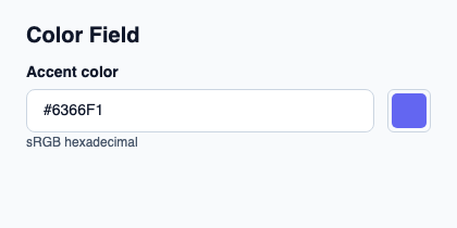
// SPDX-License-Identifier: GPL-3.0-or-later
import { KitColorField, KitTheme, KitThemes } from "@kit/kit.slint";

export component Example inherits Window {
    title: "KitColorField example";
    preferred-width: 420px;
    preferred-height: 210px;
    max-width: 100000px;
    max-height: 100000px;
    background: root.theme.canvas;
    in-out property <KitTheme> theme: KitThemes.light;
    in-out property <string> status;
    VerticalLayout {
        padding: 24px; spacing: 16px; alignment: start;
        Text { text: "Color Field"; color: root.theme.text-primary; font-size: 20px * root.theme.text-scale; font-weight: 600; }
        KitColorField { theme: root.theme; label: "Accent color"; swatch: #6366f1; accepted-color: { red: 99, green: 102, blue: 241, alpha: 255 }; text: "#6366F1"; }
        if root.status != "": Text { text: root.status; color: root.theme.text-secondary; font-size: 12px * root.theme.text-scale; wrap: word-wrap; }
    }
}
Public API
Inherits Rectangle.
Properties
| Name | Type | Direction |
|---|---|---|
required |
bool |
in |
custom-validity |
string |
in-out |
validity |
KitValidityState |
out |
will-validate |
bool |
out |
validation-message |
string |
out |
theme |
KitTheme |
in |
control-size |
ControlSize |
in |
access |
FieldAccess |
in |
alpha-mode |
ColorAlphaMode |
in |
accepted-color |
SrgbColorView |
in |
swatch |
color |
in |
label |
string |
in |
error |
string |
in |
text |
string |
in-out |
picker-open |
bool |
out |
Types and variants
| Type | Declaration |
|---|---|
enum ColorAlphaMode |
opaque, editable |
enum ControlSize |
compact, medium, comfortable |
enum FieldAccess |
editable, read-only, disabled |
struct KitValidityState |
valid: bool, value-missing: bool, type-mismatch: bool, pattern-mismatch: bool, too-long: bool, too-short: bool, range-underflow: bool, range-overflow: bool, step-mismatch: bool, bad-input: bool, custom-error: bool, |
struct SrgbColorView |
red: int, green: int, blue: int, alpha: int |
Callbacks
invalid()edited(string)commit-requested(string)cancelled()color-requested(SrgbColorView)
Functions
check-validity() → boolreport-validity() → boolset-custom-validity(message: string)reset-validation()open-picker()cancel-picker()take-focus()