
Input Group for Slint
KitInputGroup · Slint Kit 0.3.1
Shared input surface for editors and their adjoining content.
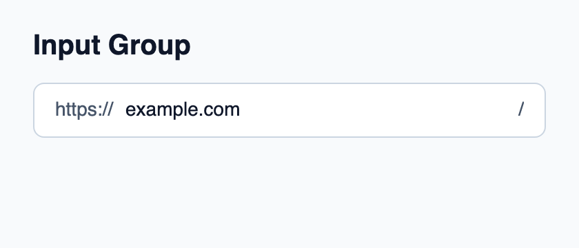
Try the component
Download the complete project, extract it and run cargo run --locked in its folder. Rust 1.92+; Slint Kit 0.3.0 from crates.io. You can also copy the four files below.
Click the native editor and change its text; the prefix or suffix stays outside the editable value.
ui/app.slint
export { KitFormValidation, HtmlInputKind, NumberInputFormat, KitInputConstraints, KitValidationResult, KitValidityState } from "@kit/kit.slint";
// SPDX-License-Identifier: GPL-3.0-or-later
import { KitInputGroup, KitInputGroupText, KitTheme, KitThemes } from "@kit/kit.slint";

export component App inherits Window {
    title: "KitInputGroup example";
    preferred-width: 420px;
    preferred-height: 180px;
    max-width: 100000px;
    max-height: 100000px;
    background: root.theme.canvas;
    in-out property <KitTheme> theme: KitThemes.light;
    in-out property <string> draft-0: "example.com";
    VerticalLayout {
        padding: 24px; spacing: 16px; alignment: start;
        Text { text: "Input Group"; color: root.theme.text-primary; font-size: 20px * root.theme.text-scale; font-weight: 600; }
        KitInputGroup {
            theme: root.theme; focused: editor.has-focus;
            HorizontalLayout {
                spacing: 8px;
                KitInputGroupText { theme: root.theme; text: "https://"; }
                Rectangle {
                    horizontal-stretch: 1; min-width: 0px; clip: true;
                    viewport := Flickable {
                        interactive: false;
                        content-width: max(self.width, editor.preferred-width + 2px);
                        content-height: self.height;
                        editor := TextInput {
                            width: viewport.content-width; height: viewport.height;
                            single-line: true;
                            accessible-label: "Website";
                            font-size: 14px * root.theme.text-scale;
                            horizontal-alignment: left; vertical-alignment: center;
                            text <=> root.draft-0; color: root.theme.text-primary;
                            cursor-position-changed(position) => {
                                if (position.x + viewport.content-x < 0px) {
                                    viewport.content-x = -position.x;
                                } else if (position.x + 2px + viewport.content-x > viewport.width) {
                                    viewport.content-x = viewport.width - position.x - 2px;
                                }
                            }
                        }
                    }
                }
                KitInputGroupText { theme: root.theme; text: "/"; }
            }
        }
    }
}
src/main.rs
// SPDX-License-Identifier: GPL-3.0-or-later
slint::include_modules!();

fn main() -> Result<(), slint::PlatformError> {
    let app = App::new()?;
    slint_kit::init_form_validation!(self, app);
    app.run()
}
Cargo.toml and build.rs
Cargo.toml
[package]
name = "slint-kit-input-group-example"
version = "0.1.0"
edition = "2024"
rust-version = "1.92"
license = "GPL-3.0-or-later"
publish = false

[dependencies]
slint-kit = "=0.3.0"
slint = { version = "=1.18.1", default-features = false, features = ["std", "compat-1-18", "backend-winit", "renderer-skia", "accessibility"] }

[build-dependencies]
slint-kit-build = "=0.3.0"

[workspace]
build.rs
fn main() {
    slint_kit_build::compile("ui/app.slint").expect("compile component example");
}
Files: Cargo.toml · build.rs · ui/app.slint · src/main.rs
Place a native editor and its prefixes or actions in one child layout. Project access, validation and focused from the composed control.
The surface owns the background, border, inset and focus ring without creating an editor or keyboard target. ValidationPresentation.invalid colors the border as an error.
Visual composition
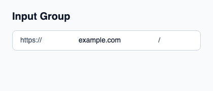
The file below produces the screenshot. For controller-driven components, it shows the displayed state without supplying the Rust wiring. Create a project.
Show the screenshot source
// SPDX-License-Identifier: GPL-3.0-or-later
import { KitInputGroup, KitInputGroupText, KitTheme, KitThemes } from "@kit/kit.slint";

export component Example inherits Window {
    title: "KitInputGroup example";
    preferred-width: 420px;
    preferred-height: 180px;
    max-width: 100000px;
    max-height: 100000px;
    background: root.theme.canvas;
    in-out property <KitTheme> theme: KitThemes.light;
    in-out property <string> status;
    VerticalLayout {
        padding: 24px; spacing: 16px; alignment: start;
        Text { text: "Input Group"; color: root.theme.text-primary; font-size: 20px * root.theme.text-scale; font-weight: 600; }
        KitInputGroup { theme: root.theme; HorizontalLayout { spacing: 8px; KitInputGroupText { theme: root.theme; text: "https://"; } TextInput { font-size: 14px * root.theme.text-scale; vertical-alignment: center; text: "example.com"; color: root.theme.text-primary; } KitInputGroupText { theme: root.theme; text: "/"; } } }
        if root.status != "": Text { text: root.status; color: root.theme.text-secondary; font-size: 12px * root.theme.text-scale; wrap: word-wrap; }
    }
}
Public API
Inherits Rectangle.
Properties
| Name | Type | Direction |
|---|---|---|
theme |
KitTheme |
in |
control-size |
ControlSize |
in |
access |
FieldAccess |
in |
validation |
ValidationPresentation |
in |
focused |
bool |
in |
padding-inline |
length |
in |
padding-block |
length |
in |
Types and variants
| Type | Declaration |
|---|---|
enum ControlSize |
compact, medium, comfortable |
enum FieldAccess |
editable, read-only, disabled |
enum ValidationPresentation |
pristine, checking, valid, invalid |