
Field Label for Slint
KitFieldLabel · Slint Kit 0.3.0
Composition primitive that connects a custom field label to its editor’s focus.
Composition primitive · shared label option
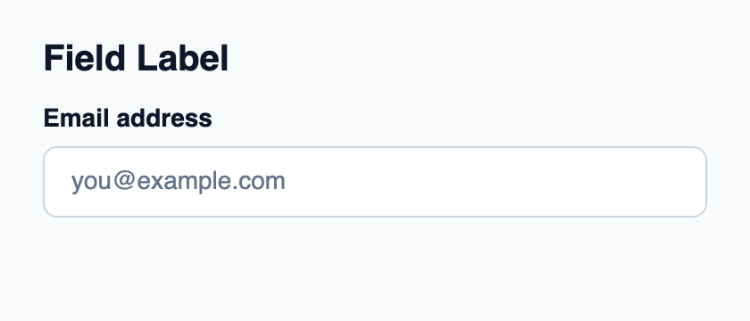
Try the component
Download the complete project, extract it and run cargo run --locked in its folder. Rust 1.92+; Slint Kit 0.3.0 from crates.io. You can also copy the four files below.
Click the label, then type in the focused native editor.
ui/app.slint
export { KitFormValidation, HtmlInputKind, NumberInputFormat, KitInputConstraints, KitValidationResult, KitValidityState } from "@kit/kit.slint";
// SPDX-License-Identifier: GPL-3.0-or-later
import { KitField, KitFieldLabel, KitTextField, KitTheme, KitThemes } from "@kit/kit.slint";

export component App inherits Window {
    title: "KitFieldLabel example";
    preferred-width: 420px;
    preferred-height: 180px;
    max-width: 100000px;
    max-height: 100000px;
    background: root.theme.canvas;
    in-out property <KitTheme> theme: KitThemes.light;
    VerticalLayout {
        padding: 24px; spacing: 16px; alignment: start;
        Text { text: "Field Label"; color: root.theme.text-primary; font-size: 20px * root.theme.text-scale; font-weight: 600; }
        KitField {
            KitFieldLabel { theme: root.theme; text: "Email address";  focus-requested => { editor.take-focus(); } } editor := KitTextField { theme: root.theme; placeholder: "you@example.com"; }
        }
    }
}
src/main.rs
// SPDX-License-Identifier: GPL-3.0-or-later
slint::include_modules!();

fn main() -> Result<(), slint::PlatformError> {
    let app = App::new()?;
    slint_kit::init_form_validation!(self, app);
    app.run()
}
Cargo.toml and build.rs
Cargo.toml
[package]
name = "slint-kit-field-label-example"
version = "0.1.0"
edition = "2024"
rust-version = "1.92"
license = "GPL-3.0-or-later"
publish = false

[dependencies]
slint-kit = "=0.3.0"
slint = { version = "=1.18.1", default-features = false, features = ["std", "compat-1-18", "backend-winit", "renderer-skia", "accessibility"] }

[build-dependencies]
slint-kit-build = "=0.3.0"

[workspace]
build.rs
fn main() {
    slint_kit_build::compile("ui/app.slint").expect("compile component example");
}
Files: Cargo.toml · build.rs · ui/app.slint · src/main.rs
For a standard field, set label on KitTextField, KitEmailField, KitTextArea or your chosen control: the label is already built in. Use a separate KitFieldLabel when composing a custom field; connect focus-requested to take-focus() and share the editor’s FieldAccess value.
The text wraps and follows the text scale. FieldAccess.disabled dims the label and prevents focus requests.
Shared option label
This demonstration uses KitFieldLabel separately. The controls below expose a built-in label property: use that property for their integrated behavior. Rendering and focus details depend on the selected control.
The 51 components exposing this property
- KitCalendar
- KitDateField
- KitDatePicker
- KitMonthField
- KitYearField
- KitIsoWeekField
- KitCheckbox
- KitSwitch
- KitRadioGroup
- KitSegmentedControl
- KitToggleGroup
- KitTagInput
- KitCombobox
- KitSlider
- KitRangeSlider
- KitRating
- KitColorField
- KitColorPicker
- KitDataTable
- KitContentList
- KitVirtualTextView
- KitTimeField
- KitTimePicker
- KitDateTimeField
- KitZonedDateTimeField
- KitDivider
- KitStat
- KitSpinner
- KitProgress
- KitRadialProgress
- KitFilePicker
- KitDirectoryPicker
- KitFileDropZone
- KitTextField
- KitPasswordField
- KitSearchField
- KitEmailField
- KitUrlField
- KitTelephoneField
- KitTextArea
- KitOtpField
- KitMaskedField
- KitCarousel
- KitNotificationButton
- KitIntegerField
- KitDecimalField
- KitMoneyField
- KitPercentField
- KitQuantityField
- KitDurationField
- KitNumberStepper
Visual composition
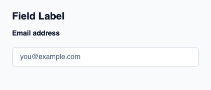
The file below produces the screenshot. For controller-driven components, it shows the displayed state without supplying the Rust wiring. Create a project.
Show the screenshot source
// SPDX-License-Identifier: GPL-3.0-or-later
import { KitFieldLabel, KitTextField, KitTheme, KitThemes } from "@kit/kit.slint";

export component Example inherits Window {
    title: "KitFieldLabel example";
    preferred-width: 420px;
    preferred-height: 180px;
    max-width: 100000px;
    max-height: 100000px;
    background: root.theme.canvas;
    in-out property <KitTheme> theme: KitThemes.light;
    in-out property <string> status;
    VerticalLayout {
        padding: 24px; spacing: 16px; alignment: start;
        Text { text: "Field Label"; color: root.theme.text-primary; font-size: 20px * root.theme.text-scale; font-weight: 600; }
        KitFieldLabel { theme: root.theme; text: "Email address"; } KitTextField { theme: root.theme; placeholder: "you@example.com"; }
        if root.status != "": Text { text: root.status; color: root.theme.text-secondary; font-size: 12px * root.theme.text-scale; wrap: word-wrap; }
    }
}
Public API
Inherits Rectangle.
Properties
| Name | Type | Direction |
|---|---|---|
theme |
KitTheme |
in |
text |
string |
in |
access |
FieldAccess |
in |
Types and variants
| Type | Declaration |
|---|---|
enum FieldAccess |
editable, read-only, disabled |
Callbacks
focus-requested()