
Select Keyboard for Slint
KitSelectKeyboard · Slint Kit 0.3.0
Shared keyboard translator for composed selectors and menus.
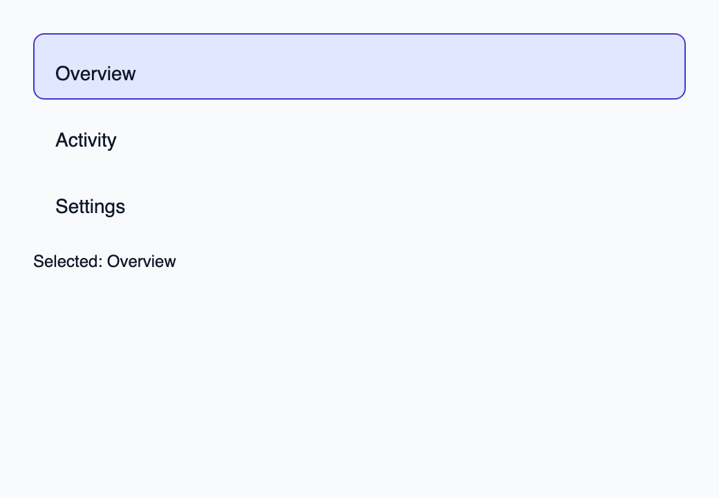
Try the component
Download the complete project, extract it and run cargo run --locked in its folder. Rust 1.92+; Slint Kit 0.3.0 from crates.io. You can also copy the four files below.
Choose Activity with the pointer, or navigate with the keyboard and press Enter. Rust accepts its key.
ui/app.slint
export { KitFormValidation, HtmlInputKind, NumberInputFormat, KitInputConstraints, KitValidationResult, KitValidityState } from "@kit/kit.slint";
// SPDX-License-Identifier: GPL-3.0-or-later
import { KitSelectKeyboard, KitOption, OptionRow, SelectState, NavigationStep, CloseReason, SelectionAvailability, KitTheme, KitThemes } from "@kit/kit.slint";
export component App inherits Window {
    title: "KitSelectKeyboard example";
    preferred-width: 520px;
    preferred-height: 360px;
    max-width: 100000px;
    max-height: 100000px;
    background: root.theme.canvas;
    in-out property <KitTheme> theme: KitThemes.light;
    in property <[OptionRow]> rows;
    in property <SelectState> select-state;
    in property <string> selected-label: "Overview";
    in-out property <string> query;
    callback select-open();
    callback select-navigate(NavigationStep);
    callback select-activate(int, int);
    callback select-dismiss(CloseReason);
    callback select-query(string);
    callback select-typeahead(string);
    VerticalLayout {
        padding: 24px;
        spacing: 16px;
        alignment: start;
        control := KitSelectKeyboard {
            height: root.rows.length * 48px; vertical-stretch: 0;
            state: root.select-state; init => { self.focus(); }
            open-requested => { root.select-open(); }
            navigate(step) => { root.select-navigate(step); }
            activate(token, generation) => { root.select-activate(token, generation); }
            dismiss(reason) => { root.select-dismiss(reason); }
            typeahead(text) => { root.select-typeahead(text); }
            tab-navigation(reverse) => { return reject; }
            VerticalLayout {
                alignment: start;
                for row in root.rows: KitOption {
                    theme: root.theme; option-data: row; height: 48px;
                    active: root.select-state.active.present && root.select-state.active.token == row.token;
                    selected: root.select-state.selected.present && root.select-state.selected.token == row.token;
                    activate(token, generation) => { root.select-activate(token, generation); }
                    Text { x: 0px; y: 0px; width: parent.width; height: parent.height; horizontal-alignment: left; font-size: 14px * root.theme.text-scale; overflow: elide; text: row.label; color: root.theme.text-primary; vertical-alignment: center; }
                }
            }
        }
        result := Text { text: "Selected: " + root.selected-label; color: root.theme.text-primary; }
    }

}
src/main.rs
// SPDX-License-Identifier: GPL-3.0-or-later
use slint::ComponentHandle;
use slint_kit::{Ownership, SelectOption, SelectionIntent};
#[derive(Clone, Copy, PartialEq, Eq, Hash)]
enum Destination { Overview, Activity, Settings }
impl Destination {
    fn label(self) -> &'static str {
        match self { Self::Overview => "Overview", Self::Activity => "Activity", Self::Settings => "Settings" }
    }
}

mod ui { slint::include_modules!(); }
fn main() -> Result<(), slint::PlatformError> {
    let app = ui::App::new()?;
    slint_kit::init_form_validation!(ui, app);
    let selection = slint_kit::bind_select!(ui, app, vec![
        SelectOption::new(Destination::Overview, "Overview"),
        SelectOption::new(Destination::Activity, "Activity"),
        SelectOption::new(Destination::Settings, "Settings"),
    ], Some(Destination::Overview), Ownership::Local);
    let weak = app.as_weak();
    selection.on_intent(move |intent| {
        if let Some(app) = weak.upgrade() {
            app.set_selected_label(match intent {
                SelectionIntent::Commit(key) => key.label(),
                SelectionIntent::Clear => "No selection",
            }.into());
        }
    });
    selection.open();
    let persistent = selection.clone();
    app.on_select_activate(move |token, generation| {
        persistent.activate(token, generation);
        persistent.open();
    });
    app.run()
}
Cargo.toml and build.rs
Cargo.toml
[package]
name = "slint-kit-select-keyboard-example"
version = "0.1.0"
edition = "2024"
rust-version = "1.92"
license = "GPL-3.0-or-later"
publish = false

[dependencies]
slint-kit = "=0.3.0"
slint = { version = "=1.18.1", default-features = false, features = ["std", "compat-1-18", "backend-winit", "renderer-skia", "accessibility"] }

[build-dependencies]
slint-kit-build = "=0.3.0"

[workspace]
build.rs
fn main() { slint_kit_build::compile("ui/app.slint").expect("compile component example"); }
Files: Cargo.toml · build.rs · ui/app.slint · src/main.rs
Place it in the control that owns focus, or call handle-key(event) from a trigger primitive. Connect its callbacks to the controller using the same SelectState.
It translates keys into NavigationStep, CloseReason, token activation and typeahead. The controller retains selection, identity and disabled-item navigation rules; tab-navigation returns an EventResult.
Visual composition
The file below produces the screenshot. For controller-driven components, it shows the displayed state without supplying the Rust wiring. Create a project.
Show the screenshot source
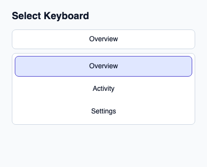
// SPDX-License-Identifier: GPL-3.0-or-later
import { KitOption, KitSelectKeyboard, KitSelectTrigger, KitTheme, KitThemes, SelectionAvailability } from "@kit/kit.slint";

export component Example inherits Window {
    title: "KitSelectKeyboard example";
    preferred-width: 420px;
    preferred-height: 340px;
    max-width: 100000px;
    max-height: 100000px;
    background: root.theme.canvas;
    in-out property <KitTheme> theme: KitThemes.light;
    in-out property <string> status;
    VerticalLayout {
        padding: 24px; spacing: 16px; alignment: start;
        Text { text: "Select Keyboard"; color: root.theme.text-primary; font-size: 20px * root.theme.text-scale; font-weight: 600; }
        KitSelectKeyboard { init => { self.focus(); } state: { open: true, generation: 1, active-index: 0, active: { present: true, token: 11 }, selected: { present: true, token: 11 }, selection-availability: SelectionAvailability.available }; navigate(step) => { root.status = "Keyboard navigation requested"; } activate(token, generation) => { root.status = "Activation requested for token " + token; } VerticalLayout { spacing: 8px; KitSelectTrigger { theme: root.theme; state: { open: true, generation: 1, active-index: 0, active: { present: true, token: 11 }, selected: { present: true, token: 11 }, selection-availability: SelectionAvailability.available }; accessible-name: "Project navigation"; Text { text: "Overview"; color: root.theme.text-primary; vertical-alignment: center; font-size: 14px * root.theme.text-scale; } } Rectangle { background: root.theme.surface-raised; border-color: root.theme.border-subtle; border-width: 1px; border-radius: 8px; VerticalLayout { padding: 6px; spacing: 4px; for row in [{ token: 11, generation: 1, label: "Overview", description: "Project summary", disabled: false }, { token: 23, generation: 1, label: "Activity", description: "Recent changes", disabled: false }, { token: 38, generation: 1, label: "Settings", description: "Project preferences", disabled: false }]: KitOption { theme: root.theme; option-data: row; active: row.token == 11; selected: row.token == 11; height: 42px; Text { text: row.label; color: root.theme.text-primary; font-size: 14px * root.theme.text-scale; vertical-alignment: center; horizontal-alignment: left; } } } } } }
        if root.status != "": Text { text: root.status; color: root.theme.text-secondary; font-size: 12px * root.theme.text-scale; wrap: word-wrap; }
    }
}
Public API
Inherits FocusScope.
Properties
| Name | Type | Direction |
|---|---|---|
state |
SelectState |
in |
dismiss-on-system-back |
bool |
in |
Types and variants
| Type | Declaration |
|---|---|
enum CloseReason |
escape, outside-press, system-back, trigger-toggle, programmatic, host-closed |
enum NavigationStep |
next, previous, first, last, page-next, page-previous |
enum SelectionAvailability |
absent, available, unavailable |
struct SelectionRef |
present: bool, token: int |
struct SelectState |
selection-availability: SelectionAvailability, selected: SelectionRef, active: SelectionRef, open: bool, active-index: int, generation: int |
Callbacks
open-requested()navigate(NavigationStep)activate(int, int)dismiss(CloseReason)typeahead(string)tab-navigation(bool) → EventResult
Functions
handle-key(event: KeyEvent) → EventResult