
Date Picker for Slint
KitDatePicker · Slint Kit 0.3.1
Date text input with a popup calendar.
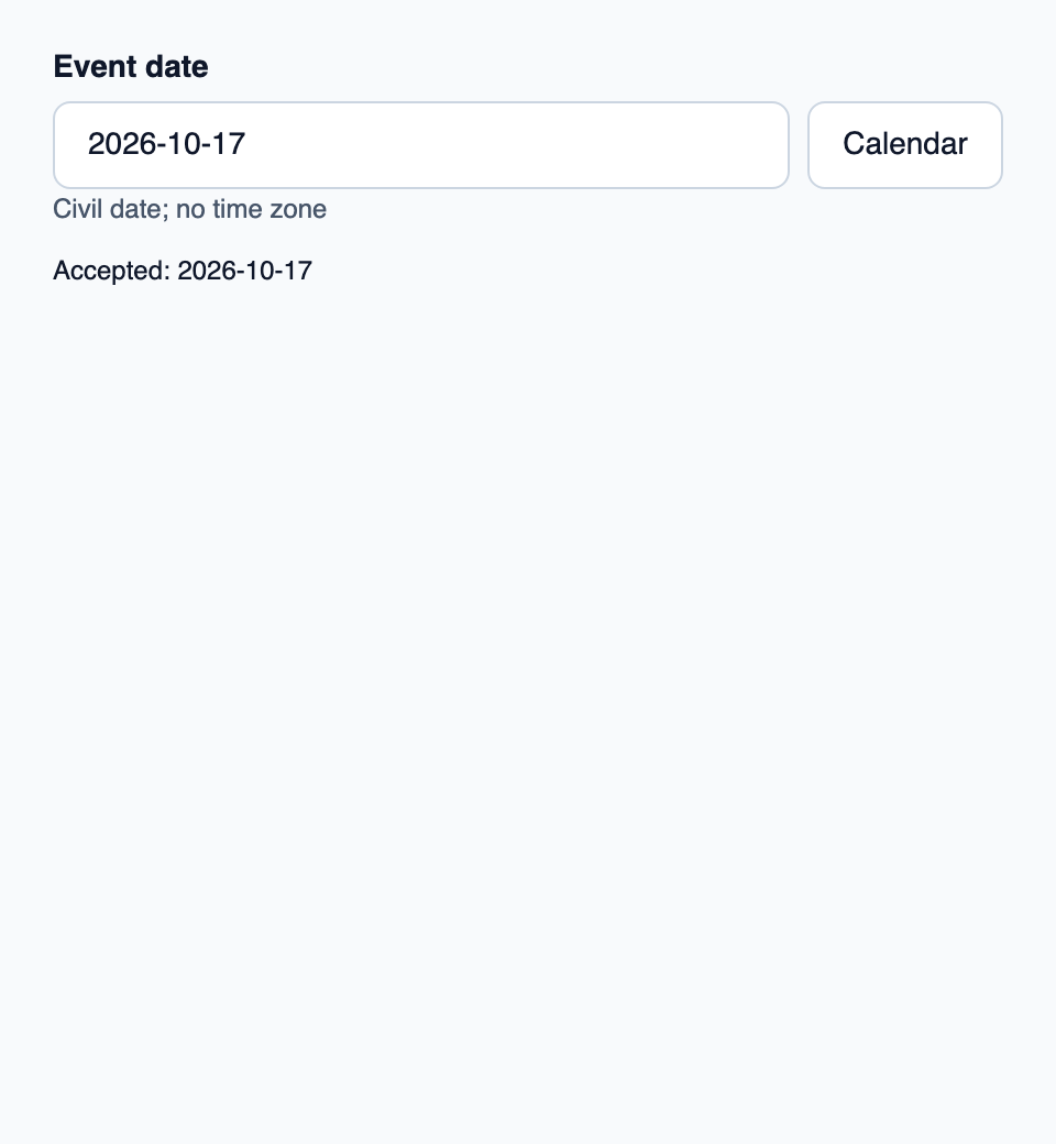
Try the component
Download the complete project, extract it and run cargo run --locked in its folder. Rust 1.92+; Slint Kit 0.3.0 from crates.io. You can also copy the four files below.
Navigate months or choose a day. Rust validates the selected civil date and regenerates the calendar grid.
ui/app.slint
export { KitFormValidation, HtmlInputKind, NumberInputFormat, KitInputConstraints, KitValidationResult, KitValidityState } from "@kit/kit.slint";
import { KitDatePicker,KitThemes,CalendarDay,CalendarNavigation,CivilDateView,DateRangePhase } from "@kit/kit.slint";
export {CalendarDay,CalendarNavigation,CivilDateView,DateRangePhase}
export component App inherits Window {
 title:"date-picker";preferred-width:480px;preferred-height:520px;max-width:100000px;max-height:100000px;background:KitThemes.light.canvas;
 in property <[CalendarDay]> days;in property <int> active;in property <string> calendar-title;in property <string> accepted;
 callback navigate(CalendarNavigation);callback choose(CalendarDay);callback cancel();in-out property <string> draft;in property <string> error;in property <CivilDateView> accepted-date;callback commit(string);
 VerticalLayout {padding:24px;spacing:16px;alignment:start;
 control:=KitDatePicker{days:root.days;weekdays:["M","T","W","T","F","S","S"];active-index:root.active;title:root.calendar-title;navigate(step)=>{root.navigate(step);}choose(day)=>{root.choose(day);}cancelled=>{root.cancel();}label:"Event date";text<=>root.draft;error:root.error;accepted-date:root.accepted-date;commit-requested(text)=>{root.commit(text);}}
 Text{text:"Accepted: "+root.accepted;color:KitThemes.light.text-primary;wrap:word-wrap;}
 }
}
src/main.rs
use slint::ComponentHandle;
use slint_kit::{CalendarController, CalendarMove, CivilDate, WeekStart};
use std::{cell::RefCell, rc::Rc};
mod ui {
    slint::include_modules!();
}
struct State {
    calendar: CalendarController,
    accepted: CivilDate,
}
fn movement(step: ui::CalendarNavigation) -> CalendarMove {
    match step {
        ui::CalendarNavigation::PreviousDay => CalendarMove::PreviousDay,
        ui::CalendarNavigation::NextDay => CalendarMove::NextDay,
        ui::CalendarNavigation::PreviousWeek => CalendarMove::PreviousWeek,
        ui::CalendarNavigation::NextWeek => CalendarMove::NextWeek,
        ui::CalendarNavigation::WeekStart => CalendarMove::WeekStart,
        ui::CalendarNavigation::WeekEnd => CalendarMove::WeekEnd,
        ui::CalendarNavigation::PreviousMonth => CalendarMove::PreviousMonth,
        ui::CalendarNavigation::NextMonth => CalendarMove::NextMonth,
        ui::CalendarNavigation::PreviousYear => CalendarMove::PreviousYear,
        ui::CalendarNavigation::NextYear => CalendarMove::NextYear,
    }
}
fn publish(app: &ui::App, state: &State) {
    let slots = state.calendar.grid_slots();
    let days = slots
        .iter()
        .map(|slot| {
            slot.map_or_else(ui::CalendarDay::default, |cell| ui::CalendarDay {
                year: cell.date.year(),
                month: cell.date.month() as i32,
                day: cell.date.day() as i32,
                label: cell.date.day().to_string().into(),
                accessible_label: cell.date.iso_string().into(),
                enabled: cell.enabled,
                selected: cell.selected,
                in_range: false,
                today: false,
            })
        })
        .collect::<Vec<_>>();

    app.set_days(slint::ModelRc::new(slint::VecModel::from(days)));
    app.set_active(
        slots
            .iter()
            .position(|s| s.is_some_and(|cell| cell.focused))
            .unwrap_or(0) as i32,
    );
    let month = state.calendar.displayed();
    app.set_calendar_title(format!("{:04}-{:02}", month.year(), month.month()).into());
    app.set_accepted(state.accepted.iso_string().into());
    app.set_accepted_date(ui::CivilDateView {
        year: state.accepted.year(),
        month: state.accepted.month() as i32,
        day: state.accepted.day() as i32,
    });
}
fn main() -> Result<(), slint::PlatformError> {
    let app = ui::App::new()?;
    slint_kit::init_form_validation!(ui, app);
    let date = CivilDate::new(2026, 10, 17).unwrap();
    let state = Rc::new(RefCell::new(State {
        calendar: CalendarController::new(Some(date), date.year_month(), None, WeekStart::Monday),
        accepted: date,
    }));
    publish(&app, &state.borrow());
    app.set_draft(date.iso_string().into());
    let weak = app.as_weak();
    let shared = state.clone();
    app.on_navigate(move |step| {
        if let Some(app) = weak.upgrade() {
            let mut state = shared.borrow_mut();
            if state.calendar.navigate(movement(step)).is_ok() {
                publish(&app, &state);
            }
        }
    });
    let weak = app.as_weak();
    let shared = state.clone();
    app.on_choose(move |day| {
        if !day.enabled {
            return;
        }
        if let (Some(app), Ok(date)) = (
            weak.upgrade(),
            CivilDate::new(day.year, day.month as u32, day.day as u32),
        ) {
            let mut state = shared.borrow_mut();
            if state.calendar.choose(date).is_ok() {
                state.accepted = date;
                app.set_draft(date.iso_string().into());
                app.set_error("".into());
                publish(&app, &state);
            }
        }
    });
    let weak = app.as_weak();
    let shared = state.clone();
    app.on_cancel(move || {
        if let Some(app) = weak.upgrade() {
            let state = shared.borrow();
            app.set_draft(state.accepted.iso_string().into());
            app.set_error("".into());
        }
    });
    let weak = app.as_weak();
    let shared = state.clone();
    app.on_commit(move |text| {
        if let Some(app) = weak.upgrade() {
            match slint_kit::CivilDate::parse_iso(&text) {
                slint_kit::DraftValue::Parsed(date) => {
                    let mut state = shared.borrow_mut();
                    if state.calendar.choose(date).is_ok() {
                        state.accepted = date;
                        app.set_draft(date.iso_string().into());
                        app.set_error("".into());
                        publish(&app, &state);
                    }
                }
                _ => app.set_error("Use a valid YYYY-MM-DD date".into()),
            }
        }
    });
    app.run()
}
Cargo.toml and build.rs
Cargo.toml
[package]
name = "slint-kit-date-picker-example"
version = "0.1.0"
edition = "2024"
rust-version = "1.92"
license = "GPL-3.0-or-later"
publish = false

[dependencies]
slint-kit = "=0.3.0"
slint = { version = "=1.18.1", default-features = false, features = ["std", "compat-1-18", "backend-winit", "renderer-skia", "accessibility"] }

[build-dependencies]
slint-kit-build = "=0.3.0"

[workspace]
build.rs
fn main() {
    slint_kit_build::compile("ui/app.slint").expect("compile component example");
}
Files: Cargo.toml · build.rs · ui/app.slint · src/main.rs
Bind the date text, supply a CalendarController day model and connect both typed commits and calendar selections.
The example parses YYYY-MM-DD. Picking a day accepts that date; cancel restores the accepted date.
Choose between built-in options and custom composition
Shared options
label— built-in property; custom composition exampledescription— built-in property; custom composition exampleerror— built-in property; custom composition example
Visual composition
The file below produces the screenshot. For controller-driven components, it shows the displayed state without supplying the Rust wiring. Create a project.
Show the screenshot source
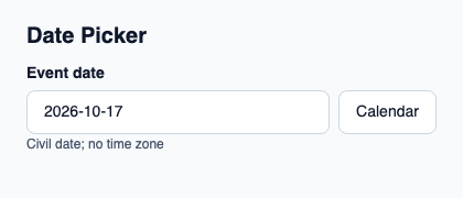
// SPDX-License-Identifier: GPL-3.0-or-later
// Display projections are fixtures. Validate accepted domain values in Rust.
import { KitDatePicker, KitTheme, KitThemes } from "@kit/kit.slint";

export component Example inherits Window {
    title: "KitDatePicker example";
    preferred-width: 420px;
    preferred-height: 180px;
    max-width: 100000px;
    max-height: 100000px;
    background: root.theme.canvas;
    in-out property <KitTheme> theme: KitThemes.light;
    in-out property <string> status;
    VerticalLayout {
        padding: 24px; spacing: 16px; alignment: start;
        Text { text: "Date Picker"; color: root.theme.text-primary; font-size: 20px * root.theme.text-scale; font-weight: 600; }
        KitDatePicker { theme: root.theme; label: "Event date"; text: "2026-10-17"; accepted-date: { year: 2026, month: 10, day: 17 }; title: "October 2026"; days: [{ year: 2026, month: 9, day: 28, label: "28", accessible-label: "September 28, 2026", enabled: false, selected: false, today: false, in-range: false }, { year: 2026, month: 9, day: 29, label: "29", accessible-label: "September 29, 2026", enabled: false, selected: false, today: false, in-range: false }, { year: 2026, month: 9, day: 30, label: "30", accessible-label: "September 30, 2026", enabled: false, selected: false, today: false, in-range: false }, { year: 2026, month: 10, day: 1, label: "1", accessible-label: "October 1, 2026", enabled: true, selected: false, today: false, in-range: false }, { year: 2026, month: 10, day: 2, label: "2", accessible-label: "October 2, 2026", enabled: true, selected: false, today: false, in-range: false }, { year: 2026, month: 10, day: 3, label: "3", accessible-label: "October 3, 2026", enabled: true, selected: false, today: false, in-range: false }, { year: 2026, month: 10, day: 4, label: "4", accessible-label: "October 4, 2026", enabled: true, selected: false, today: false, in-range: false }, { year: 2026, month: 10, day: 5, label: "5", accessible-label: "October 5, 2026", enabled: true, selected: false, today: false, in-range: false }, { year: 2026, month: 10, day: 6, label: "6", accessible-label: "October 6, 2026", enabled: true, selected: false, today: false, in-range: false }, { year: 2026, month: 10, day: 7, label: "7", accessible-label: "October 7, 2026", enabled: true, selected: false, today: false, in-range: false }, { year: 2026, month: 10, day: 8, label: "8", accessible-label: "October 8, 2026", enabled: true, selected: false, today: false, in-range: false }, { year: 2026, month: 10, day: 9, label: "9", accessible-label: "October 9, 2026", enabled: true, selected: false, today: false, in-range: false }, { year: 2026, month: 10, day: 10, label: "10", accessible-label: "October 10, 2026", enabled: true, selected: false, today: false, in-range: false }, { year: 2026, month: 10, day: 11, label: "11", accessible-label: "October 11, 2026", enabled: true, selected: false, today: false, in-range: false }, { year: 2026, month: 10, day: 12, label: "12", accessible-label: "October 12, 2026", enabled: true, selected: false, today: false, in-range: false }, { year: 2026, month: 10, day: 13, label: "13", accessible-label: "October 13, 2026", enabled: true, selected: false, today: false, in-range: false }, { year: 2026, month: 10, day: 14, label: "14", accessible-label: "October 14, 2026", enabled: true, selected: false, today: false, in-range: false }, { year: 2026, month: 10, day: 15, label: "15", accessible-label: "October 15, 2026", enabled: true, selected: false, today: false, in-range: false }, { year: 2026, month: 10, day: 16, label: "16", accessible-label: "October 16, 2026", enabled: true, selected: false, today: false, in-range: false }, { year: 2026, month: 10, day: 17, label: "17", accessible-label: "October 17, 2026", enabled: true, selected: true, today: true, in-range: false }, { year: 2026, month: 10, day: 18, label: "18", accessible-label: "October 18, 2026", enabled: true, selected: false, today: false, in-range: false }, { year: 2026, month: 10, day: 19, label: "19", accessible-label: "October 19, 2026", enabled: true, selected: false, today: false, in-range: false }, { year: 2026, month: 10, day: 20, label: "20", accessible-label: "October 20, 2026", enabled: true, selected: false, today: false, in-range: false }, { year: 2026, month: 10, day: 21, label: "21", accessible-label: "October 21, 2026", enabled: true, selected: false, today: false, in-range: false }, { year: 2026, month: 10, day: 22, label: "22", accessible-label: "October 22, 2026", enabled: true, selected: false, today: false, in-range: false }, { year: 2026, month: 10, day: 23, label: "23", accessible-label: "October 23, 2026", enabled: true, selected: false, today: false, in-range: false }, { year: 2026, month: 10, day: 24, label: "24", accessible-label: "October 24, 2026", enabled: true, selected: false, today: false, in-range: false }, { year: 2026, month: 10, day: 25, label: "25", accessible-label: "October 25, 2026", enabled: true, selected: false, today: false, in-range: false }, { year: 2026, month: 10, day: 26, label: "26", accessible-label: "October 26, 2026", enabled: true, selected: false, today: false, in-range: false }, { year: 2026, month: 10, day: 27, label: "27", accessible-label: "October 27, 2026", enabled: true, selected: false, today: false, in-range: false }, { year: 2026, month: 10, day: 28, label: "28", accessible-label: "October 28, 2026", enabled: true, selected: false, today: false, in-range: false }, { year: 2026, month: 10, day: 29, label: "29", accessible-label: "October 29, 2026", enabled: true, selected: false, today: false, in-range: false }, { year: 2026, month: 10, day: 30, label: "30", accessible-label: "October 30, 2026", enabled: true, selected: false, today: false, in-range: false }, { year: 2026, month: 10, day: 31, label: "31", accessible-label: "October 31, 2026", enabled: true, selected: false, today: false, in-range: false }, { year: 2026, month: 11, day: 1, label: "1", accessible-label: "November 1, 2026", enabled: false, selected: false, today: false, in-range: false }, { year: 2026, month: 11, day: 2, label: "2", accessible-label: "November 2, 2026", enabled: false, selected: false, today: false, in-range: false }, { year: 2026, month: 11, day: 3, label: "3", accessible-label: "November 3, 2026", enabled: false, selected: false, today: false, in-range: false }, { year: 2026, month: 11, day: 4, label: "4", accessible-label: "November 4, 2026", enabled: false, selected: false, today: false, in-range: false }, { year: 2026, month: 11, day: 5, label: "5", accessible-label: "November 5, 2026", enabled: false, selected: false, today: false, in-range: false }, { year: 2026, month: 11, day: 6, label: "6", accessible-label: "November 6, 2026", enabled: false, selected: false, today: false, in-range: false }, { year: 2026, month: 11, day: 7, label: "7", accessible-label: "November 7, 2026", enabled: false, selected: false, today: false, in-range: false }, { year: 2026, month: 11, day: 8, label: "8", accessible-label: "November 8, 2026", enabled: false, selected: false, today: false, in-range: false }]; weekdays: ["M", "T", "W", "T", "F", "S", "S"]; }
        if root.status != "": Text { text: root.status; color: root.theme.text-secondary; font-size: 12px * root.theme.text-scale; wrap: word-wrap; }
    }
}
Public API
Inherits Rectangle.
Properties
| Name | Type | Direction |
|---|---|---|
required |
bool |
in |
min |
string |
in |
max |
string |
in |
step |
string |
in |
default-value |
string |
in |
custom-validity |
string |
in-out |
validity |
KitValidityState |
out |
will-validate |
bool |
out |
validation-message |
string |
out |
theme |
KitTheme |
in |
control-size |
ControlSize |
in |
access |
FieldAccess |
in |
accepted-date |
CivilDateView |
in |
days |
[CalendarDay] |
in |
weekdays |
[string] |
in |
active-index |
int |
in |
title |
string |
in |
label |
string |
in |
placeholder |
string |
in |
description |
string |
in |
calendar-button-label |
string |
in |
calendar-accessible-name |
string |
in |
previous-month-label |
string |
in |
next-month-label |
string |
in |
error |
string |
in |
text |
string |
in-out |
open |
bool |
in-out |
Types and variants
| Type | Declaration |
|---|---|
struct CalendarDay |
year: int, month: int, day: int, label: string, accessible-label: string, enabled: bool, selected: bool, in-range: bool, today: bool, |
enum CalendarNavigation |
previous-day, next-day, previous-week, next-week, week-start, week-end, previous-month, next-month, previous-year, next-year |
struct CivilDateView |
year: int, month: int, day: int |
enum ControlSize |
compact, medium, comfortable |
enum FieldAccess |
editable, read-only, disabled |
struct KitValidityState |
valid: bool, value-missing: bool, type-mismatch: bool, pattern-mismatch: bool, too-long: bool, too-short: bool, range-underflow: bool, range-overflow: bool, step-mismatch: bool, bad-input: bool, custom-error: bool, |
Callbacks
invalid()edited(string)commit-requested(string)navigate(CalendarNavigation)choose(CalendarDay)cancelled()opened()
Functions
check-validity() → boolreport-validity() → boolset-custom-validity(message: string)reset-validation()take-focus()