
Field Description for Slint
KitFieldDescription · Slint Kit 0.3.1
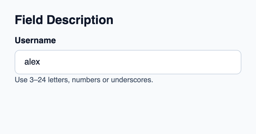
Secondary help text for a field.
Composition primitive · shared description option
Try the component
Download the complete project, extract it and run cargo run --locked in its folder. Rust 1.92+; Slint Kit 0.3.0 from crates.io. You can also copy the four files below.
Run the app to inspect this composition and resize its window.
ui/app.slint
export { KitFormValidation, HtmlInputKind, NumberInputFormat, KitInputConstraints, KitValidationResult, KitValidityState } from "@kit/kit.slint";
// SPDX-License-Identifier: GPL-3.0-or-later
import { KitField, KitFieldDescription, KitTextField, KitTheme, KitThemes } from "@kit/kit.slint";

export component App inherits Window {
    title: "KitFieldDescription example";
    preferred-width: 420px;
    preferred-height: 220px;
    max-width: 100000px;
    max-height: 100000px;
    background: root.theme.canvas;
    in-out property <KitTheme> theme: KitThemes.light;
    in-out property <string> draft-0: "alex";
    VerticalLayout {
        padding: 24px; spacing: 16px; alignment: start;
        Text { text: "Field Description"; color: root.theme.text-primary; font-size: 20px * root.theme.text-scale; font-weight: 600; }
        KitField {
            KitTextField { theme: root.theme; label: "Username"; text <=> root.draft-0; } KitFieldDescription { theme: root.theme; text: "Use 3–24 letters, numbers or underscores."; }
        }
    }
}
src/main.rs
// SPDX-License-Identifier: GPL-3.0-or-later
slint::include_modules!();

fn main() -> Result<(), slint::PlatformError> {
    let app = App::new()?;
    slint_kit::init_form_validation!(self, app);
    app.run()
}
Cargo.toml and build.rs
Cargo.toml
[package]
name = "slint-kit-field-description-example"
version = "0.1.0"
edition = "2024"
rust-version = "1.92"
license = "GPL-3.0-or-later"
publish = false

[dependencies]
slint-kit = "=0.3.0"
slint = { version = "=1.18.1", default-features = false, features = ["std", "compat-1-18", "backend-winit", "renderer-skia", "accessibility"] }

[build-dependencies]
slint-kit-build = "=0.3.0"

[workspace]
build.rs
fn main() {
    slint_kit_build::compile("ui/app.slint").expect("compile component example");
}
Files: Cargo.toml · build.rs · ui/app.slint · src/main.rs
Place it below the editor inside KitField and set its inherited text property. Use it for persistent instructions or the expected format.
It uses caption typography and wraps. Showing it does not change the field’s validation state.
Shared option description
This demonstration uses KitFieldDescription separately. The controls below expose a built-in description property: use that property for their integrated behavior. Rendering and focus details depend on the selected control.
The 28 components exposing this property
- KitDateField
- KitDatePicker
- KitMonthField
- KitYearField
- KitIsoWeekField
- KitTimeField
- KitCardHeader
- KitHero
- KitStat
- KitEmptyState
- KitFilePicker
- KitTextField
- KitPasswordField
- KitSearchField
- KitEmailField
- KitUrlField
- KitTelephoneField
- KitTextArea
- KitOtpField
- KitMaskedField
- KitSection
- KitIntegerField
- KitDecimalField
- KitMoneyField
- KitPercentField
- KitQuantityField
- KitDurationField
- KitNumberStepper
Visual composition
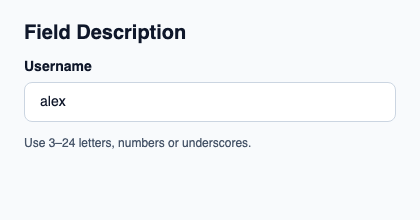
The file below produces the screenshot. For controller-driven components, it shows the displayed state without supplying the Rust wiring. Create a project.
Show the screenshot source
// SPDX-License-Identifier: GPL-3.0-or-later
import { KitFieldDescription, KitTextField, KitTheme, KitThemes } from "@kit/kit.slint";

export component Example inherits Window {
    title: "KitFieldDescription example";
    preferred-width: 420px;
    preferred-height: 220px;
    max-width: 100000px;
    max-height: 100000px;
    background: root.theme.canvas;
    in-out property <KitTheme> theme: KitThemes.light;
    in-out property <string> status;
    VerticalLayout {
        padding: 24px; spacing: 16px; alignment: start;
        Text { text: "Field Description"; color: root.theme.text-primary; font-size: 20px * root.theme.text-scale; font-weight: 600; }
        KitTextField { theme: root.theme; label: "Username"; text: "alex"; } KitFieldDescription { theme: root.theme; text: "Use 3–24 letters, numbers or underscores."; }
        if root.status != "": Text { text: root.status; color: root.theme.text-secondary; font-size: 12px * root.theme.text-scale; wrap: word-wrap; }
    }
}
Public API
Inherits Text.
Properties
| Name | Type | Direction |
|---|---|---|
theme |
KitTheme |
in |