
Champ avec préfixe ou suffixe pour Slint
KitInputGroup · Slint Kit 0.3.1
Surface de saisie commune aux éditeurs et à leurs éléments adjacents.
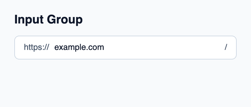
Essayer le composant
Télécharger le projet complet, le décompresser et lancer cargo run --locked dans son dossier. Rust 1.92+ ; Slint Kit 0.3.0 depuis crates.io. Vous pouvez aussi copier les quatre fichiers ci-dessous.
Cliquez sur le champ natif et modifiez son texte ; le préfixe ou suffixe reste séparé de la valeur éditable.
ui/app.slint
export { KitFormValidation, HtmlInputKind, NumberInputFormat, KitInputConstraints, KitValidationResult, KitValidityState } from "@kit/kit.slint";
// SPDX-License-Identifier: GPL-3.0-or-later
import { KitInputGroup, KitInputGroupText, KitTheme, KitThemes } from "@kit/kit.slint";

export component App inherits Window {
    title: "KitInputGroup example";
    preferred-width: 420px;
    preferred-height: 180px;
    max-width: 100000px;
    max-height: 100000px;
    background: root.theme.canvas;
    in-out property <KitTheme> theme: KitThemes.light;
    in-out property <string> draft-0: "example.com";
    VerticalLayout {
        padding: 24px; spacing: 16px; alignment: start;
        Text { text: "Input Group"; color: root.theme.text-primary; font-size: 20px * root.theme.text-scale; font-weight: 600; }
        KitInputGroup {
            theme: root.theme; focused: editor.has-focus;
            HorizontalLayout {
                spacing: 8px;
                KitInputGroupText { theme: root.theme; text: "https://"; }
                Rectangle {
                    horizontal-stretch: 1; min-width: 0px; clip: true;
                    viewport := Flickable {
                        interactive: false;
                        content-width: max(self.width, editor.preferred-width + 2px);
                        content-height: self.height;
                        editor := TextInput {
                            width: viewport.content-width; height: viewport.height;
                            single-line: true;
                            accessible-label: "Website";
                            font-size: 14px * root.theme.text-scale;
                            horizontal-alignment: left; vertical-alignment: center;
                            text <=> root.draft-0; color: root.theme.text-primary;
                            cursor-position-changed(position) => {
                                if (position.x + viewport.content-x < 0px) {
                                    viewport.content-x = -position.x;
                                } else if (position.x + 2px + viewport.content-x > viewport.width) {
                                    viewport.content-x = viewport.width - position.x - 2px;
                                }
                            }
                        }
                    }
                }
                KitInputGroupText { theme: root.theme; text: "/"; }
            }
        }
    }
}
src/main.rs
// SPDX-License-Identifier: GPL-3.0-or-later
slint::include_modules!();

fn main() -> Result<(), slint::PlatformError> {
    let app = App::new()?;
    slint_kit::init_form_validation!(self, app);
    app.run()
}
Cargo.toml et build.rs
Cargo.toml
[package]
name = "slint-kit-input-group-example"
version = "0.1.0"
edition = "2024"
rust-version = "1.92"
license = "GPL-3.0-or-later"
publish = false

[dependencies]
slint-kit = "=0.3.0"
slint = { version = "=1.18.1", default-features = false, features = ["std", "compat-1-18", "backend-winit", "renderer-skia", "accessibility"] }

[build-dependencies]
slint-kit-build = "=0.3.0"

[workspace]
build.rs
fn main() {
    slint_kit_build::compile("ui/app.slint").expect("compile component example");
}
Fichiers : Cargo.toml · build.rs · ui/app.slint · src/main.rs
Placez un éditeur natif et ses préfixes ou actions dans une mise en page enfant unique. Projetez access, validation et focused depuis le contrôle composé.
La surface possède le fond, la bordure, l’inset et l’anneau de focus, sans créer d’éditeur ni de cible clavier. ValidationPresentation.invalid colore la bordure en erreur.
Composition visuelle
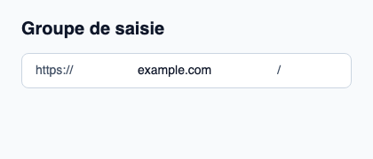
Le fichier ci-dessous produit la capture. Pour les composants pilotés par un contrôleur, il montre l’état affiché sans fournir le branchement Rust. Créer un projet.
Afficher le fichier de la capture
// Public label overrides localize this fixture; toolkit/host defaults keep their language.
// SPDX-License-Identifier: GPL-3.0-or-later
import { KitInputGroup, KitInputGroupText, KitTheme, KitThemes } from "@kit/kit.slint";

export component Example inherits Window {
    title: "KitInputGroup — exemple";
    preferred-width: 420px;
    preferred-height: 180px;
    max-width: 100000px;
    max-height: 100000px;
    background: root.theme.canvas;
    in-out property <KitTheme> theme: KitThemes.light;
    in-out property <string> status;
    VerticalLayout {
        padding: 24px; spacing: 16px; alignment: start;
        Text { text: "Groupe de saisie"; color: root.theme.text-primary; font-size: 20px * root.theme.text-scale; font-weight: 600; }
        KitInputGroup { theme: root.theme; HorizontalLayout { spacing: 8px; KitInputGroupText { theme: root.theme; text: "https://"; } TextInput { font-size: 14px * root.theme.text-scale; vertical-alignment: center; text: "example.com"; color: root.theme.text-primary; } KitInputGroupText { theme: root.theme; text: "/"; } } }
        if root.status != "": Text { text: root.status; color: root.theme.text-secondary; font-size: 12px * root.theme.text-scale; wrap: word-wrap; }
    }
}
API publique
Hérite de Rectangle.
Propriétés
| Nom | Type | Sens |
|---|---|---|
theme |
KitTheme |
in |
control-size |
ControlSize |
in |
access |
FieldAccess |
in |
validation |
ValidationPresentation |
in |
focused |
bool |
in |
padding-inline |
length |
in |
padding-block |
length |
in |
Types et variantes
| Type | Déclaration |
|---|---|
enum ControlSize |
compact, medium, comfortable |
enum FieldAccess |
editable, read-only, disabled |
enum ValidationPresentation |
pristine, checking, valid, invalid |