
Corps de carte pour Slint
KitCardBody · Slint Kit 0.3.0
Colonne de contenu principal à l’intérieur d’une carte.
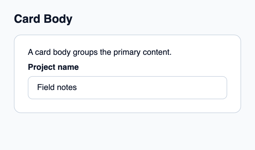
Essayer le composant
Télécharger le projet complet, le décompresser et lancer cargo run --locked dans son dossier. Rust 1.92+ ; Slint Kit 0.3.0 depuis crates.io. Vous pouvez aussi copier les quatre fichiers ci-dessous.
Lancez l’application pour observer cette composition et redimensionner sa fenêtre.
ui/app.slint
export { KitFormValidation, HtmlInputKind, NumberInputFormat, KitInputConstraints, KitValidationResult, KitValidityState } from "@kit/kit.slint";
// SPDX-License-Identifier: GPL-3.0-or-later
import { KitCard, KitCardBody, KitTextField, KitTheme, KitThemes } from "@kit/kit.slint";

export component App inherits Window {
    title: "KitCardBody example";
    preferred-width: 440px;
    preferred-height: 260px;
    max-width: 100000px;
    max-height: 100000px;
    background: root.theme.canvas;
    in-out property <KitTheme> theme: KitThemes.light;
    in-out property <string> draft-0: "Field notes";
    VerticalLayout {
        padding: 24px; spacing: 16px; alignment: start;
        Text { text: "Card Body"; color: root.theme.text-primary; font-size: 20px * root.theme.text-scale; font-weight: 600; }
        KitCard { theme: root.theme; KitCardBody { Text { text: "A card body groups the primary content."; color: root.theme.text-primary; font-size: 14px * root.theme.text-scale; wrap: word-wrap; } KitTextField { theme: root.theme; label: "Project name"; text <=> root.draft-0; } } }
    }
}
src/main.rs
// SPDX-License-Identifier: GPL-3.0-or-later
slint::include_modules!();

fn main() -> Result<(), slint::PlatformError> {
    let app = App::new()?;
    slint_kit::init_form_validation!(self, app);
    app.run()
}
Cargo.toml et build.rs
Cargo.toml
[package]
name = "slint-kit-card-body-example"
version = "0.1.0"
edition = "2024"
rust-version = "1.92"
license = "GPL-3.0-or-later"
publish = false

[dependencies]
slint-kit = "=0.3.0"
slint = { version = "=1.18.1", default-features = false, features = ["std", "compat-1-18", "backend-winit", "renderer-skia", "accessibility"] }

[build-dependencies]
slint-kit-build = "=0.3.0"

[workspace]
build.rs
fn main() {
    slint_kit_build::compile("ui/app.slint").expect("compile component example");
}
Fichiers : Cargo.toml · build.rs · ui/app.slint · src/main.rs
Placez le texte, les champs ou les données comme enfants entre l’en-tête et le pied. Laissez KitCard posséder l’inset extérieur.
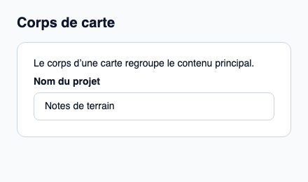
Le corps applique un espacement de 12 px et une hauteur naturelle. Il n’ajoute ni fond ni bordure supplémentaires.
Composition visuelle
Le fichier ci-dessous produit la capture. Pour les composants pilotés par un contrôleur, il montre l’état affiché sans fournir le branchement Rust. Créer un projet.
Afficher le fichier de la capture
// Public label overrides localize this fixture; toolkit/host defaults keep their language.
// SPDX-License-Identifier: GPL-3.0-or-later
import { KitCard, KitCardBody, KitTextField, KitTheme, KitThemes } from "@kit/kit.slint";

export component Example inherits Window {
    title: "KitCardBody — exemple";
    preferred-width: 440px;
    preferred-height: 260px;
    max-width: 100000px;
    max-height: 100000px;
    background: root.theme.canvas;
    in-out property <KitTheme> theme: KitThemes.light;
    in-out property <string> status;
    VerticalLayout {
        padding: 24px; spacing: 16px; alignment: start;
        Text { text: "Corps de carte"; color: root.theme.text-primary; font-size: 20px * root.theme.text-scale; font-weight: 600; }
        KitCard { theme: root.theme; KitCardBody { Text { text: "Le corps d’une carte regroupe le contenu principal."; color: root.theme.text-primary; font-size: 14px * root.theme.text-scale; wrap: word-wrap; } KitTextField { character-count-label: "caractères"; checking-label: "Vérification…"; clear-label: "Effacer la recherche"; hide-label: "Masquer le mot de passe"; reveal-label: "Afficher le mot de passe"; theme: root.theme; label: "Nom du projet"; text: "Notes de terrain"; } } }
        if root.status != "": Text { text: root.status; color: root.theme.text-secondary; font-size: 12px * root.theme.text-scale; wrap: word-wrap; }
    }
}
API publique
Hérite de VerticalLayout.