
Barre de menus pour Slint
KitMenuBar · Slint Kit 0.3.1
Barre de menus Slint pour les actions ou destinations d’une fenêtre.
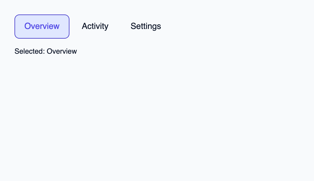
Essayer le composant
Télécharger le projet complet, le décompresser et lancer cargo run --locked dans son dossier. Rust 1.92+ ; Slint Kit 0.3.0 depuis crates.io. Vous pouvez aussi copier les quatre fichiers ci-dessous.
Choisissez Activity : Rust conserve Destination::Activity et actualise le libellé.
ui/app.slint
export { KitFormValidation, HtmlInputKind, NumberInputFormat, KitInputConstraints, KitValidationResult, KitValidityState } from "@kit/kit.slint";
// SPDX-License-Identifier: GPL-3.0-or-later
import { KitMenuBar, OptionRow, SelectState, NavigationStep, CloseReason, SelectionAvailability, KitTheme, KitThemes } from "@kit/kit.slint";
export component App inherits Window {
    title: "KitMenuBar example";
    preferred-width: 520px;
    preferred-height: 300px;
    max-width: 100000px;
    max-height: 100000px;
    background: root.theme.canvas;
    in-out property <KitTheme> theme: KitThemes.light;
    in property <[OptionRow]> rows;
    in property <SelectState> select-state;
    in property <string> selected-label: "Overview";
    in-out property <string> query;
    callback select-open();
    callback select-navigate(NavigationStep);
    callback select-activate(int, int);
    callback select-dismiss(CloseReason);
    callback select-query(string);
    callback select-typeahead(string);
    VerticalLayout {
        padding: 24px;
        spacing: 16px;
        alignment: start;
        control := KitMenuBar {
            theme: root.theme; rows: root.rows; state: root.select-state;
            navigate(step) => { root.select-navigate(step); }
            activate(token, generation) => { root.select-activate(token, generation); }
            dismiss(reason) => { root.select-dismiss(reason); }
            typeahead(text) => { root.select-typeahead(text); }
        }
        result := Text { text: "Selected: " + root.selected-label; color: root.theme.text-primary; }
    }

}
src/main.rs
// SPDX-License-Identifier: GPL-3.0-or-later
use slint::ComponentHandle;
use slint_kit::{Ownership, SelectOption, SelectionIntent};
#[derive(Clone, Copy, PartialEq, Eq, Hash)]
enum Destination { Overview, Activity, Settings }
impl Destination {
    fn label(self) -> &'static str {
        match self { Self::Overview => "Overview", Self::Activity => "Activity", Self::Settings => "Settings" }
    }
}

mod ui { slint::include_modules!(); }
fn main() -> Result<(), slint::PlatformError> {
    let app = ui::App::new()?;
    slint_kit::init_form_validation!(ui, app);
    let selection = slint_kit::bind_select!(ui, app, vec![
        SelectOption::new(Destination::Overview, "Overview"),
        SelectOption::new(Destination::Activity, "Activity"),
        SelectOption::new(Destination::Settings, "Settings"),
    ], Some(Destination::Overview), Ownership::Local);
    let weak = app.as_weak();
    selection.on_intent(move |intent| {
        if let Some(app) = weak.upgrade() {
            app.set_selected_label(match intent {
                SelectionIntent::Commit(key) => key.label(),
                SelectionIntent::Clear => "No selection",
            }.into());
        }
    });
    selection.open();
    let persistent = selection.clone();
    app.on_select_activate(move |token, generation| {
        persistent.activate(token, generation);
        persistent.open();
    });
    app.run()
}
Cargo.toml et build.rs
Cargo.toml
[package]
name = "slint-kit-menu-bar-example"
version = "0.1.0"
edition = "2024"
rust-version = "1.92"
license = "GPL-3.0-or-later"
publish = false

[dependencies]
slint-kit = "=0.3.0"
slint = { version = "=1.18.1", default-features = false, features = ["std", "compat-1-18", "backend-winit", "renderer-skia", "accessibility"] }

[build-dependencies]
slint-kit-build = "=0.3.0"

[workspace]
build.rs
fn main() { slint_kit_build::compile("ui/app.slint").expect("compile component example"); }
Fichiers : Cargo.toml · build.rs · ui/app.slint · src/main.rs
Reliez rows et state à SelectBinding. Transmettez la navigation et l’activation ; son intention de sélection typée identifie la destination à ouvrir.
Gauche et Droite demandent l’élément actif précédent ou suivant. Projetez le nouvel état pour surligner l’action active et la rendre visible dans le défilement. Avec SelectBinding, rouvrez le contrôle persistant après un choix validé.
Composition visuelle
Le fichier ci-dessous produit la capture. Pour les composants pilotés par un contrôleur, il montre l’état affiché sans fournir le branchement Rust. Créer un projet.
Afficher le fichier de la capture
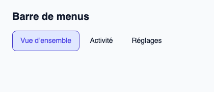
// Public label overrides localize this fixture; toolkit/host defaults keep their language.
// SPDX-License-Identifier: GPL-3.0-or-later
import { KitMenuBar, KitTheme, KitThemes, SelectionAvailability } from "@kit/kit.slint";

export component Example inherits Window {
    title: "KitMenuBar — exemple";
    preferred-width: 420px;
    preferred-height: 180px;
    max-width: 100000px;
    max-height: 100000px;
    background: root.theme.canvas;
    in-out property <KitTheme> theme: KitThemes.light;
    in-out property <string> status;
    VerticalLayout {
        padding: 24px; spacing: 16px; alignment: start;
        Text { text: "Barre de menus"; color: root.theme.text-primary; font-size: 20px * root.theme.text-scale; font-weight: 600; }
        KitMenuBar { accessible-name: "Actions"; theme: root.theme; rows: [{ token: 11, generation: 1, label: "Vue d’ensemble", description: "Résumé du projet", disabled: false }, { token: 23, generation: 1, label: "Activité", description: "Modifications récentes", disabled: false }, { token: 38, generation: 1, label: "Réglages", description: "Préférences du projet", disabled: false }]; state: { open: false, generation: 1, active-index: 0, active: { present: true, token: 11 }, selected: { present: true, token: 11 }, selection-availability: SelectionAvailability.available }; activate(token, generation) => { root.status = "Activation demandée pour l’identifiant stable " + token; } }
        if root.status != "": Text { text: root.status; color: root.theme.text-secondary; font-size: 12px * root.theme.text-scale; wrap: word-wrap; }
    }
}
API publique
Hérite de Rectangle.
Propriétés
| Nom | Type | Sens |
|---|---|---|
theme |
KitTheme |
in |
control-size |
ControlSize |
in |
rows |
[OptionRow] |
in |
state |
SelectState |
in |
accessible-name |
string |
in |
Types et variantes
| Type | Déclaration |
|---|---|
enum CloseReason |
escape, outside-press, system-back, trigger-toggle, programmatic, host-closed |
enum ControlSize |
compact, medium, comfortable |
enum NavigationStep |
next, previous, first, last, page-next, page-previous |
struct OptionRow |
token: int, generation: int, label: string, description: string, disabled: bool |
enum SelectionAvailability |
absent, available, unavailable |
struct SelectionRef |
present: bool, token: int |
struct SelectState |
selection-availability: SelectionAvailability, selected: SelectionRef, active: SelectionRef, open: bool, active-index: int, generation: int |
Signaux
navigate(NavigationStep)activate(int, int)dismiss(CloseReason)typeahead(string)
Fonctions
take-focus()reveal(left: length, right: length)handle-key(event: KeyEvent) → EventResult