
Groupe de boutons radio pour Slint
KitRadioGroup · Slint Kit 0.3.1
Groupe de choix exclusifs avec une cible clavier commune.
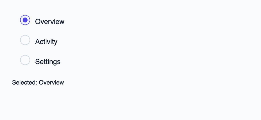
Essayer le composant
Télécharger le projet complet, le décompresser et lancer cargo run --locked dans son dossier. Rust 1.92+ ; Slint Kit 0.3.0 depuis crates.io. Vous pouvez aussi copier les quatre fichiers ci-dessous.
Sélectionnez Activity : Rust accepte la clé et redessine l’élément sélectionné.
ui/app.slint
export { KitFormValidation, HtmlInputKind, NumberInputFormat, KitInputConstraints, KitValidationResult, KitValidityState } from "@kit/kit.slint";
// SPDX-License-Identifier: GPL-3.0-or-later
import { KitRadioGroup, OptionRow, SelectState, NavigationStep, CloseReason, SelectionAvailability, KitTheme, KitThemes } from "@kit/kit.slint";
export component App inherits Window {
    title: "KitRadioGroup example";
    preferred-width: 520px;
    preferred-height: 240px;
    max-width: 100000px;
    max-height: 100000px;
    background: root.theme.canvas;
    in-out property <KitTheme> theme: KitThemes.light;
    in property <[OptionRow]> rows;
    in property <SelectState> select-state;
    in property <string> selected-label: "Overview";
    in-out property <string> query;
    callback select-open();
    callback select-navigate(NavigationStep);
    callback select-activate(int, int);
    callback select-dismiss(CloseReason);
    callback select-query(string);
    callback select-typeahead(string);
    VerticalLayout {
        padding: 24px;
        spacing: 16px;
        alignment: start;
        control := KitRadioGroup {
            theme: root.theme; label: "Destination";
            rows: [{ token: root.rows[0].token, label: root.rows[0].label, disabled: false, selected: root.select-state.selected.present && root.select-state.selected.token == root.rows[0].token }, { token: root.rows[1].token, label: root.rows[1].label, disabled: false, selected: root.select-state.selected.present && root.select-state.selected.token == root.rows[1].token }, { token: root.rows[2].token, label: root.rows[2].label, disabled: false, selected: root.select-state.selected.present && root.select-state.selected.token == root.rows[2].token }];
            generation: root.select-state.generation; active-token: root.select-state.active.token;
            navigate(step) => { root.select-navigate(step); }
            activate(token, generation) => { root.select-activate(token, generation); }
        }
        result := Text { text: "Selected: " + root.selected-label; color: root.theme.text-primary; }
    }

}
src/main.rs
// SPDX-License-Identifier: GPL-3.0-or-later
use slint::ComponentHandle;
use slint_kit::{Ownership, SelectOption, SelectionIntent};
#[derive(Clone, Copy, PartialEq, Eq, Hash)]
enum Destination { Overview, Activity, Settings }
impl Destination {
    fn label(self) -> &'static str {
        match self { Self::Overview => "Overview", Self::Activity => "Activity", Self::Settings => "Settings" }
    }
}

mod ui { slint::include_modules!(); }
fn main() -> Result<(), slint::PlatformError> {
    let app = ui::App::new()?;
    slint_kit::init_form_validation!(ui, app);
    let selection = slint_kit::bind_select!(ui, app, vec![
        SelectOption::new(Destination::Overview, "Overview"),
        SelectOption::new(Destination::Activity, "Activity"),
        SelectOption::new(Destination::Settings, "Settings"),
    ], Some(Destination::Overview), Ownership::Local);
    let weak = app.as_weak();
    selection.on_intent(move |intent| {
        if let Some(app) = weak.upgrade() {
            app.set_selected_label(match intent {
                SelectionIntent::Commit(key) => key.label(),
                SelectionIntent::Clear => "No selection",
            }.into());
        }
    });
    selection.open();
    let persistent = selection.clone();
    app.on_select_activate(move |token, generation| {
        persistent.activate(token, generation);
        persistent.open();
    });
    app.run()
}
Cargo.toml et build.rs
Cargo.toml
[package]
name = "slint-kit-radio-group-example"
version = "0.1.0"
edition = "2024"
rust-version = "1.92"
license = "GPL-3.0-or-later"
publish = false

[dependencies]
slint-kit = "=0.3.0"
slint = { version = "=1.18.1", default-features = false, features = ["std", "compat-1-18", "backend-winit", "renderer-skia", "accessibility"] }

[build-dependencies]
slint-kit-build = "=0.3.0"

[workspace]
build.rs
fn main() { slint_kit_build::compile("ui/app.slint").expect("compile component example"); }
Fichiers : Cargo.toml · build.rs · ui/app.slint · src/main.rs
Fournissez des ChoiceRow, une generation et active-token, puis traitez navigate et activate(token, generation). Choisissez ChoiceDirection.horizontal ou .vertical et la politique ChoiceFlow.
La sélection vient de ChoiceRow.selected, indépendamment du token actif. Le contrôleur applique l’exclusivité et les règles de navigation, tandis que les lignes conservent leurs identités. Avec SelectBinding, rouvrez le contrôle persistant après un choix validé.
Choisir entre une option intégrée et une composition personnalisée
Options partagées
label— propriété intégrée ; exemple de composition personnalisé
Composition visuelle
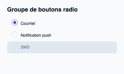
Le fichier ci-dessous produit la capture. Pour les composants pilotés par un contrôleur, il montre l’état affiché sans fournir le branchement Rust. Créer un projet.
Afficher le fichier de la capture
// Public label overrides localize this fixture; toolkit/host defaults keep their language.
// SPDX-License-Identifier: GPL-3.0-or-later
import { KitRadioGroup, KitTheme, KitThemes } from "@kit/kit.slint";

export component Example inherits Window {
    title: "KitRadioGroup — exemple";
    preferred-width: 420px;
    preferred-height: 250px;
    max-width: 100000px;
    max-height: 100000px;
    background: root.theme.canvas;
    in-out property <KitTheme> theme: KitThemes.light;
    in-out property <string> status;
    VerticalLayout {
        padding: 24px; spacing: 16px; alignment: start;
        Text { text: "Groupe de boutons radio"; color: root.theme.text-primary; font-size: 20px * root.theme.text-scale; font-weight: 600; }
        KitRadioGroup { width: 372px; theme: root.theme; rows: [{ token: 11, label: "Courriel", selected: true, disabled: false }, { token: 23, label: "Notification push", selected: false, disabled: false }, { token: 38, label: "SMS", selected: false, disabled: true }]; generation: 1; active-token: 11; activate(token, generation) => { root.status = "Identifiant du choix " + token; } }
        if root.status != "": Text { text: root.status; color: root.theme.text-secondary; font-size: 12px * root.theme.text-scale; wrap: word-wrap; }
    }
}
API publique
Hérite de Rectangle.
Propriétés
| Nom | Type | Sens |
|---|---|---|
required |
bool |
in |
required-message |
string |
in |
custom-validity |
string |
in-out |
validity |
KitValidityState |
out |
will-validate |
bool |
out |
validation-message |
string |
out |
theme |
KitTheme |
in |
control-size |
ControlSize |
in |
access |
FieldAccess |
in |
rows |
[ChoiceRow] |
in |
generation |
int |
in |
active-token |
int |
in |
direction |
ChoiceDirection |
in |
flow |
ChoiceFlow |
in |
label |
string |
in |
has-focus |
bool |
out |
Types et variantes
| Type | Déclaration |
|---|---|
enum ChoiceDirection |
horizontal, vertical |
enum ChoiceFlow |
left-to-right, right-to-left |
struct ChoiceRow |
token: int, label: string, disabled: bool, selected: bool |
enum ControlSize |
compact, medium, comfortable |
enum FieldAccess |
editable, read-only, disabled |
struct KitValidityState |
valid: bool, value-missing: bool, type-mismatch: bool, pattern-mismatch: bool, too-long: bool, too-short: bool, range-underflow: bool, range-overflow: bool, step-mismatch: bool, bad-input: bool, custom-error: bool, |
enum NavigationStep |
next, previous, first, last, page-next, page-previous |
Signaux
invalid()navigate(NavigationStep)activate(int, int)
Fonctions
check-validity() → boolreport-validity() → boolset-custom-validity(message: string)reset-validation()take-focus()