
Actions de dialogue pour Slint
KitDialogFooter · Slint Kit 0.3.0
Emplacement de fin pour les actions d’un dialogue.
Essayer le composant
Télécharger le projet complet, le décompresser et lancer cargo run --locked dans son dossier. Rust 1.92+ ; Slint Kit 0.3.0 depuis crates.io. Vous pouvez aussi copier les quatre fichiers ci-dessous.
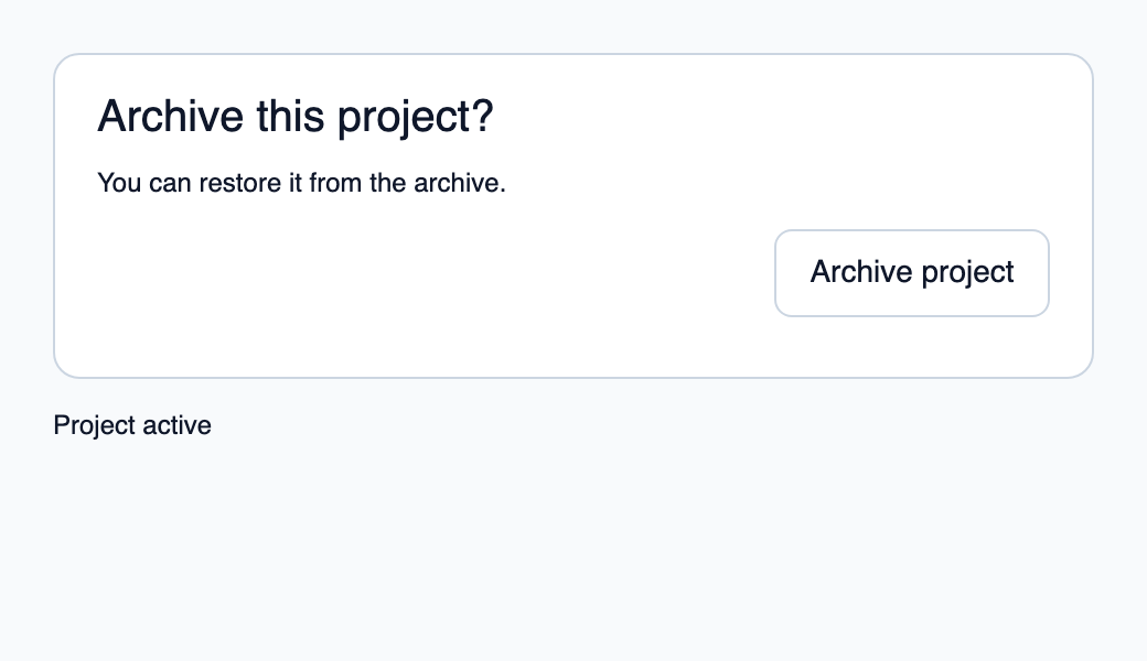
Composez les sections dans un panneau, puis archivez le projet avec un callback Rust.
ui/app.slint
export { KitFormValidation, HtmlInputKind, NumberInputFormat, KitInputConstraints, KitValidationResult, KitValidityState } from "@kit/kit.slint";
// SPDX-License-Identifier: GPL-3.0-or-later
import { KitDialogPanel, KitDialogHeader, KitDialogBody, KitDialogFooter, KitButton, KitTheme, KitThemes } from "@kit/kit.slint";
export component App inherits Window {
    title: "KitDialogFooter example";
    preferred-width: 520px;
    preferred-height: 300px;
    max-width: 100000px;
    max-height: 100000px;
    background: root.theme.canvas;
    in-out property <KitTheme> theme: KitThemes.light;
    in property <bool> archived;
    callback archive();
    VerticalLayout {
        padding: 24px;
        spacing: 16px;
        alignment: start;
        panel := KitDialogPanel {
            theme: root.theme; accessible-name: "Archive project";
            height: content.preferred-height;
            content := VerticalLayout {
                padding: 20px; spacing: 14px;
                header := KitDialogHeader { theme: root.theme; height: self.preferred-height; Text { text: "Archive this project?"; color: root.theme.text-primary; font-size: 20px * root.theme.text-scale; wrap: word-wrap; } }
                body := KitDialogBody { theme: root.theme; height: self.preferred-height; Text { text: "You can restore it from the archive."; color: root.theme.text-primary; wrap: word-wrap; } }
                footer := KitDialogFooter { theme: root.theme; height: 48px; KitButton { theme: root.theme; text: "Archive project"; disabled: root.archived; activated => { root.archive(); } } }
            }
        }
        result := Text { text: root.archived ? "Project archived" : "Project active"; color: root.theme.text-primary; }
    }

}
src/main.rs
// SPDX-License-Identifier: GPL-3.0-or-later
use slint::ComponentHandle;

mod ui { slint::include_modules!(); }
fn main() -> Result<(), slint::PlatformError> {
    let app = ui::App::new()?;
    slint_kit::init_form_validation!(ui, app);
    let weak = app.as_weak();
    app.on_archive(move || { if let Some(app) = weak.upgrade() { app.set_archived(true); } });
    app.run()
}
Cargo.toml et build.rs
Cargo.toml
[package]
name = "slint-kit-dialog-footer-example"
version = "0.1.0"
edition = "2024"
rust-version = "1.92"
license = "GPL-3.0-or-later"
publish = false

[dependencies]
slint-kit = "=0.3.0"
slint = { version = "=1.18.1", default-features = false, features = ["std", "compat-1-18", "backend-winit", "renderer-skia", "accessibility"] }

[build-dependencies]
slint-kit-build = "=0.3.0"

[workspace]
build.rs
fn main() { slint_kit_build::compile("ui/app.slint").expect("compile component example"); }
Fichiers : Cargo.toml · build.rs · ui/app.slint · src/main.rs
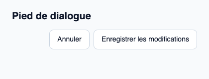
Placez les boutons dans l’ordre de lecture et reliez leurs actions au contrôleur du dialogue. Utilisez busy ou disabled sur les actions pendant une opération.
La ligne est alignée à la fin avec un espacement de 8 px et une hauteur minimale de 48 px. Le pied ne ferme pas automatiquement la modale.
Composition visuelle
Le fichier ci-dessous produit la capture. Pour les composants pilotés par un contrôleur, il montre l’état affiché sans fournir le branchement Rust. Créer un projet.
Afficher le fichier de la capture
// Public label overrides localize this fixture; toolkit/host defaults keep their language.
// SPDX-License-Identifier: GPL-3.0-or-later
import { KitButton, KitDialogFooter, KitTheme, KitThemes } from "@kit/kit.slint";

export component Example inherits Window {
    title: "KitDialogFooter — exemple";
    preferred-width: 420px;
    preferred-height: 160px;
    max-width: 100000px;
    max-height: 100000px;
    background: root.theme.canvas;
    in-out property <KitTheme> theme: KitThemes.light;
    in-out property <string> status;
    VerticalLayout {
        padding: 24px; spacing: 16px; alignment: start;
        Text { text: "Pied de dialogue"; color: root.theme.text-primary; font-size: 20px * root.theme.text-scale; font-weight: 600; }
        KitDialogFooter { theme: root.theme; vertical-stretch: 0; KitButton { theme: root.theme; text: "Annuler"; activated => { root.status = "Action demandée"; } }KitButton { theme: root.theme; text: "Enregistrer les modifications"; activated => { root.status = "Action demandée"; } } }
        if root.status != "": Text { text: root.status; color: root.theme.text-secondary; font-size: 12px * root.theme.text-scale; wrap: word-wrap; }
    }
}
API publique
Hérite de Rectangle.
Propriétés
| Nom | Type | Sens |
|---|---|---|
theme |
KitTheme |
in |