
Corps de dialogue pour Slint
KitDialogBody · Slint Kit 0.3.0
Emplacement vertical pour le contenu principal d’un dialogue.
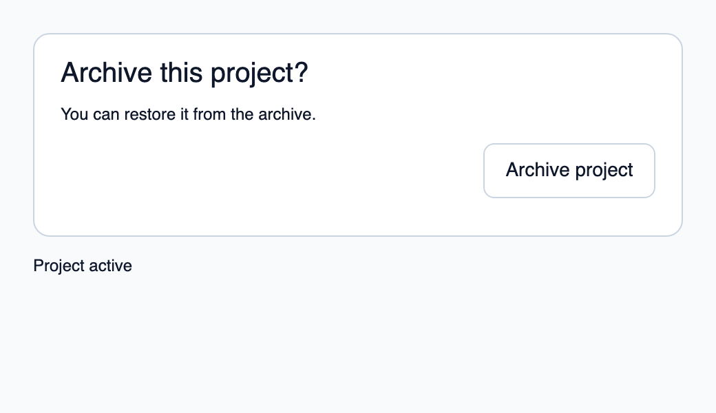
Essayer le composant
Télécharger le projet complet, le décompresser et lancer cargo run --locked dans son dossier. Rust 1.92+ ; Slint Kit 0.3.0 depuis crates.io. Vous pouvez aussi copier les quatre fichiers ci-dessous.
Composez les sections dans un panneau, puis archivez le projet avec un callback Rust.
ui/app.slint
export { KitFormValidation, HtmlInputKind, NumberInputFormat, KitInputConstraints, KitValidationResult, KitValidityState } from "@kit/kit.slint";
// SPDX-License-Identifier: GPL-3.0-or-later
import { KitDialogPanel, KitDialogHeader, KitDialogBody, KitDialogFooter, KitButton, KitTheme, KitThemes } from "@kit/kit.slint";
export component App inherits Window {
    title: "KitDialogBody example";
    preferred-width: 520px;
    preferred-height: 300px;
    max-width: 100000px;
    max-height: 100000px;
    background: root.theme.canvas;
    in-out property <KitTheme> theme: KitThemes.light;
    in property <bool> archived;
    callback archive();
    VerticalLayout {
        padding: 24px;
        spacing: 16px;
        alignment: start;
        panel := KitDialogPanel {
            theme: root.theme; accessible-name: "Archive project";
            height: content.preferred-height;
            content := VerticalLayout {
                padding: 20px; spacing: 14px;
                header := KitDialogHeader { theme: root.theme; height: self.preferred-height; Text { text: "Archive this project?"; color: root.theme.text-primary; font-size: 20px * root.theme.text-scale; wrap: word-wrap; } }
                body := KitDialogBody { theme: root.theme; height: self.preferred-height; Text { text: "You can restore it from the archive."; color: root.theme.text-primary; wrap: word-wrap; } }
                footer := KitDialogFooter { theme: root.theme; height: 48px; KitButton { theme: root.theme; text: "Archive project"; disabled: root.archived; activated => { root.archive(); } } }
            }
        }
        result := Text { text: root.archived ? "Project archived" : "Project active"; color: root.theme.text-primary; }
    }

}
src/main.rs
// SPDX-License-Identifier: GPL-3.0-or-later
use slint::ComponentHandle;

mod ui { slint::include_modules!(); }
fn main() -> Result<(), slint::PlatformError> {
    let app = ui::App::new()?;
    slint_kit::init_form_validation!(ui, app);
    let weak = app.as_weak();
    app.on_archive(move || { if let Some(app) = weak.upgrade() { app.set_archived(true); } });
    app.run()
}
Cargo.toml et build.rs
Cargo.toml
[package]
name = "slint-kit-dialog-body-example"
version = "0.1.0"
edition = "2024"
rust-version = "1.92"
license = "GPL-3.0-or-later"
publish = false

[dependencies]
slint-kit = "=0.3.0"
slint = { version = "=1.18.1", default-features = false, features = ["std", "compat-1-18", "backend-winit", "renderer-skia", "accessibility"] }

[build-dependencies]
slint-kit-build = "=0.3.0"

[workspace]
build.rs
fn main() { slint_kit_build::compile("ui/app.slint").expect("compile component example"); }
Fichiers : Cargo.toml · build.rs · ui/app.slint · src/main.rs
Ajoutez des messages, champs ou contenus dans ses enfants et composez-le entre l’en-tête et le pied. Enregistrez les contrôles interactifs dans le registre de focus modal.
Il fournit une hauteur minimale de 48 px et un espacement de 12 px. Il n’ajoute pas de défilement implicite ; prévoyez un viewport si le contenu peut dépasser.
Composition visuelle
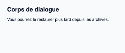
Le fichier ci-dessous produit la capture. Pour les composants pilotés par un contrôleur, il montre l’état affiché sans fournir le branchement Rust. Créer un projet.
Afficher le fichier de la capture
// Public label overrides localize this fixture; toolkit/host defaults keep their language.
// SPDX-License-Identifier: GPL-3.0-or-later
import { KitDialogBody, KitTheme, KitThemes } from "@kit/kit.slint";

export component Example inherits Window {
    title: "KitDialogBody — exemple";
    preferred-width: 420px;
    preferred-height: 180px;
    max-width: 100000px;
    max-height: 100000px;
    background: root.theme.canvas;
    in-out property <KitTheme> theme: KitThemes.light;
    in-out property <string> status;
    VerticalLayout {
        padding: 24px; spacing: 16px; alignment: start;
        Text { text: "Corps de dialogue"; color: root.theme.text-primary; font-size: 20px * root.theme.text-scale; font-weight: 600; }
        KitDialogBody { theme: root.theme; vertical-stretch: 0; Text { text: "Vous pourrez le restaurer plus tard depuis les archives."; color: root.theme.text-primary; font-size: 14px * root.theme.text-scale; wrap: word-wrap; vertical-stretch: 0; } }
        if root.status != "": Text { text: root.status; color: root.theme.text-secondary; font-size: 12px * root.theme.text-scale; wrap: word-wrap; }
    }
}
API publique
Hérite de Rectangle.
Propriétés
| Nom | Type | Sens |
|---|---|---|
theme |
KitTheme |
in |