
Surface modale pour Slint
KitDialogSurface · Slint Kit 0.3.1
Hôte modal qui gère le voile, les demandes de fermeture et le parcours du focus.
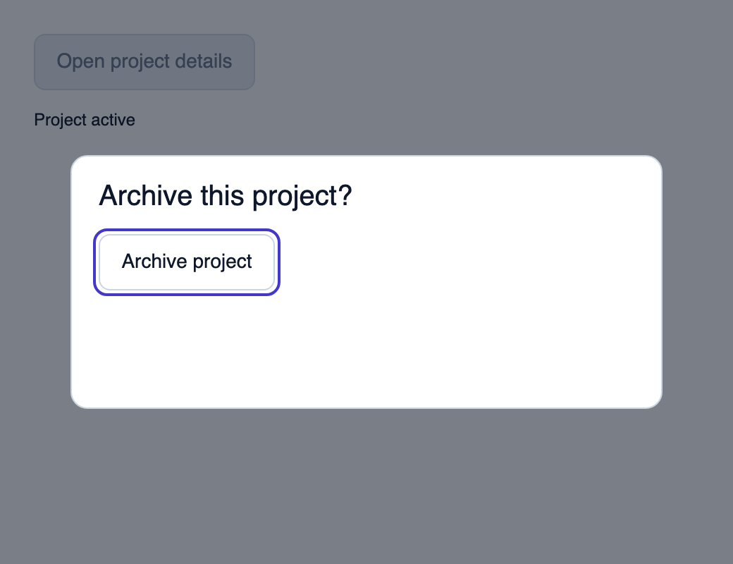
Essayer le composant
Télécharger le projet complet, le décompresser et lancer cargo run --locked dans son dossier. Rust 1.92+ ; Slint Kit 0.3.0 depuis crates.io. Vous pouvez aussi copier les quatre fichiers ci-dessous.
Ouvrez les détails, archivez le projet ou fermez avec Échap. La fermeture rétablit le focus sur le bouton d’ouverture.
ui/app.slint
export { KitFormValidation, HtmlInputKind, NumberInputFormat, KitInputConstraints, KitValidationResult, KitValidityState } from "@kit/kit.slint";
// SPDX-License-Identifier: GPL-3.0-or-later
import { KitDialogSurface, KitDialogPanel, KitButton, DialogTabPolicy, CloseReason, KitTheme, KitThemes } from "@kit/kit.slint";
export component App inherits Window {
    title: "KitDialogSurface example";
    preferred-width: 520px;
    preferred-height: 400px;
    max-width: 100000px;
    max-height: 100000px;
    background: root.theme.canvas;
    in-out property <KitTheme> theme: KitThemes.light;
    in property <bool> showing;
    in property <string> result: "Project active";
    callback open();
    callback close(CloseReason);
    callback archive();
    public function focus-opener() { opener.take-focus(); }
    public function focus-dialog() { archive-button.take-focus(); }

    VerticalLayout {
        padding: 24px;
        spacing: 16px;
        alignment: start;
        opener := KitButton { theme: root.theme; text: "Open project details"; disabled: root.showing; activated => { root.open(); } }
        Text { text: root.result; color: root.theme.text-primary; }

    }
    modal := KitDialogSurface {
        theme: root.theme; width: root.width; height: root.height;
        state: { open: root.showing, topmost: root.showing, busy: false };
        tab-policy: DialogTabPolicy.native;
        dismiss(reason) => { root.close(reason); }
        KitDialogPanel {
            theme: root.theme; accessible-name: "Archive project";
            width: min(420px, parent.width - 40px); height: 180px;
            x: (parent.width - self.width) / 2; y: (parent.height - self.height) / 2;
            VerticalLayout { padding: 20px; spacing: 16px; alignment: start;
            Text { text: "Archive this project?"; color: root.theme.text-primary; font-size: 20px * root.theme.text-scale; wrap: word-wrap; }
            archive-button := KitButton { theme: root.theme; text: "Archive project"; activated => { root.archive(); } }
            }
        }
    }
}
src/main.rs
// SPDX-License-Identifier: GPL-3.0-or-later
use slint::ComponentHandle;
use slint_kit::{OverlayStack, OverlaySpec, OverlayId, DismissReason, CloseResult};
mod ui { slint::include_modules!(); }
fn main() -> Result<(), slint::PlatformError> {
    let app = ui::App::new()?;
    slint_kit::init_form_validation!(ui, app);
    let overlays = std::rc::Rc::new(std::cell::RefCell::new(OverlayStack::new()));
    let weak = app.as_weak();
    let stack = overlays.clone();
    app.on_open(move || {
        if let Some(app) = weak.upgrade() {
            if stack.borrow().is_empty() {
                stack.borrow_mut().push(OverlaySpec::new(OverlayId(1), None, true)).expect("single modal");
                app.set_showing(true);
                app.invoke_focus_dialog();
            }
        }
    });
    let weak = app.as_weak();
    let stack = overlays.clone();
    app.on_close(move |reason| {
        let reason = match reason {
            ui::CloseReason::Escape => DismissReason::Escape,
            ui::CloseReason::OutsidePress => DismissReason::OutsidePress,
            ui::CloseReason::SystemBack => DismissReason::SystemBack,
            ui::CloseReason::TriggerToggle => DismissReason::TriggerToggle,
            ui::CloseReason::Programmatic => DismissReason::Programmatic,
            ui::CloseReason::HostClosed => DismissReason::HostClosed,
        };
        let closed = matches!(stack.borrow_mut().request_close(reason), CloseResult::Closed(_));
        if closed { if let Some(app) = weak.upgrade() { app.set_showing(false); app.invoke_focus_opener(); } }
    });
    let weak = app.as_weak();
    app.on_archive(move || { if let Some(app) = weak.upgrade() { app.set_result("Project archived".into()); app.invoke_close(ui::CloseReason::Programmatic); } });
    app.run()
}
Cargo.toml et build.rs
Cargo.toml
[package]
name = "slint-kit-dialog-surface-example"
version = "0.1.0"
edition = "2024"
rust-version = "1.92"
license = "GPL-3.0-or-later"
publish = false

[dependencies]
slint-kit = "=0.3.0"
slint = { version = "=1.18.1", default-features = false, features = ["std", "compat-1-18", "backend-winit", "renderer-skia", "accessibility"] }

[build-dependencies]
slint-kit-build = "=0.3.0"

[workspace]
build.rs
fn main() { slint_kit_build::compile("ui/app.slint").expect("compile component example"); }
Fichiers : Cargo.toml · build.rs · ui/app.slint · src/main.rs
Rendez-le en dernier dans sa fenêtre et fournissez DialogState depuis OverlayStack. Avec tab-policy: DialogTabPolicy.host (défaut), reliez focus-next(bool) au registre des cibles réelles. Avec .native, laissez Slint parcourir les contrôles montés et rendez toutes les cibles d’arrière-plan inéligibles pendant la modale, notamment via FieldAccess.disabled, disabled, ou interactive: false selon le composant.
Seule la modale topmost traite Échap et Retour système (Key.Back), en demandant respectivement CloseReason.escape et .system-back. busy consomme ces touches sans demander la fermeture. En mode host, elle capture Tab/Maj+Tab ; en mode native, elle les laisse au parcours Slint. La politique native ne désactive pas automatiquement l’arrière-plan. Un clic sur le voile demande CloseReason.outside-press si dismiss-on-backdrop est activé.
Composition visuelle
Le fichier ci-dessous produit la capture. Pour les composants pilotés par un contrôleur, il montre l’état affiché sans fournir le branchement Rust. Créer un projet.
Afficher le fichier de la capture
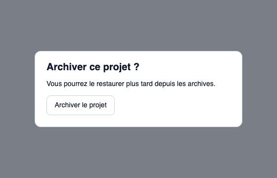
// Public label overrides localize this fixture; toolkit/host defaults keep their language.
// SPDX-License-Identifier: GPL-3.0-or-later
import { DialogTabPolicy, KitButton, KitDialogPanel, KitDialogSurface, KitTheme, KitThemes } from "@kit/kit.slint";

export component Example inherits Window {
    title: "KitDialogSurface — exemple";
    preferred-width: 560px;
    preferred-height: 360px;
    max-width: 100000px;
    max-height: 100000px;
    background: root.theme.canvas;
    in-out property <KitTheme> theme: KitThemes.light;
    in-out property <string> status;
    KitDialogSurface { tab-policy: DialogTabPolicy.native; theme: root.theme; width: parent.width; height: parent.height; state: { open: true, topmost: true, busy: false }; KitDialogPanel { theme: root.theme; width: 420px; x: (parent.width - self.width) / 2; y: (parent.height - self.height) / 2; height: dialog-content.preferred-height; horizontal-stretch: 0; vertical-stretch: 0; accessible-name: "Archiver le projet"; dialog-content := VerticalLayout { padding: 24px; spacing: 16px; alignment: start; Text { text: "Archiver ce projet ?"; color: root.theme.text-primary; font-size: 20px * root.theme.text-scale; font-weight: 600; wrap: word-wrap; vertical-stretch: 0; }Text { text: "Vous pourrez le restaurer plus tard depuis les archives."; color: root.theme.text-primary; font-size: 14px * root.theme.text-scale; wrap: word-wrap; vertical-stretch: 0; }KitButton { theme: root.theme; text: "Archiver le projet"; activated => { root.status = "Action demandée"; } }if root.status != "": Text { text: root.status; color: root.theme.text-secondary; font-size: 12px * root.theme.text-scale; wrap: word-wrap; vertical-stretch: 0; } } } }
}
API publique
Hérite de Rectangle.
Propriétés
| Nom | Type | Sens |
|---|---|---|
theme |
KitTheme |
in |
state |
DialogState |
in |
dismiss-on-backdrop |
bool |
in |
tab-policy |
DialogTabPolicy |
in |
Types et variantes
| Type | Déclaration |
|---|---|
enum CloseReason |
escape, outside-press, system-back, trigger-toggle, programmatic, host-closed |
struct DialogState |
open: bool, topmost: bool, busy: bool |
enum DialogTabPolicy |
host, native |
Signaux
dismiss(CloseReason)focus-next(bool)