
Surface activable pour Slint
KitPressable · Slint Kit 0.3.0
Primitive d’action qui centralise le pointeur, le clavier et le focus pour vos boutons personnalisés.
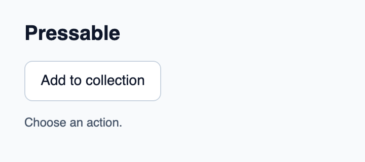
Essayer le composant
Télécharger le projet complet, le décompresser et lancer cargo run --locked dans son dossier. Rust 1.92+ ; Slint Kit 0.3.0 depuis crates.io. Vous pouvez aussi copier les quatre fichiers ci-dessous.
Cliquez sur Add to collection : Rust traite la commande et actualise le compteur d’actions.
ui/app.slint
export { KitFormValidation, HtmlInputKind, NumberInputFormat, KitInputConstraints, KitValidationResult, KitValidityState } from "@kit/kit.slint";
// SPDX-License-Identifier: GPL-3.0-or-later
import { KitPressable, KitTheme, KitThemes } from "@kit/kit.slint";

export enum DemoAction { add-to-collection }

export component App inherits Window {
    title: "KitPressable example";
    preferred-width: 360px;
    preferred-height: 160px;
    max-width: 100000px;
    max-height: 100000px;
    background: root.theme.canvas;
    in-out property <KitTheme> theme: KitThemes.light;
    in property <string> status: "Choose an action.";
    callback action-requested(DemoAction);
    VerticalLayout {
        padding: 24px; spacing: 16px; alignment: start;
        Text { text: "Pressable"; color: root.theme.text-primary; font-size: 20px * root.theme.text-scale; font-weight: 600; }
        KitPressable { theme: root.theme; preferred-width: content.preferred-width + 32px; min-width: self.preferred-width; accessible-name: "Add to collection"; activated => { root.action-requested(DemoAction.add-to-collection); } content := Text { text: "Add to collection"; color: root.theme.text-primary; font-size: 14px * root.theme.text-scale; horizontal-alignment: center; vertical-alignment: center; } }
        Text { text: root.status; color: root.theme.text-secondary; wrap: word-wrap; }
    }
}
src/main.rs
// SPDX-License-Identifier: GPL-3.0-or-later
use slint::ComponentHandle;
use std::cell::Cell;
slint::include_modules!();

fn main() -> Result<(), slint::PlatformError> {
    let app = App::new()?;
    slint_kit::init_form_validation!(self, app);
    let count = Cell::new(0_u32);
    let weak = app.as_weak();
    app.on_action_requested(move |action| {
        if let Some(app) = weak.upgrade() {
            let next = count.get().checked_add(1).expect("action count capacity");
            count.set(next);
            let label = match action {
                DemoAction::AddToCollection => "Add to collection",
            };
            app.set_status(format!("{label} handled by Rust ({next})").into());
        }
    });
    app.run()
}
Cargo.toml et build.rs
Cargo.toml
[package]
name = "slint-kit-pressable-example"
version = "0.1.0"
edition = "2024"
rust-version = "1.92"
license = "GPL-3.0-or-later"
publish = false

[dependencies]
slint-kit = "=0.3.0"
slint = { version = "=1.18.1", default-features = false, features = ["std", "compat-1-18", "backend-winit", "renderer-skia", "accessibility"] }

[build-dependencies]
slint-kit-build = "=0.3.0"

[workspace]
build.rs
fn main() {
    slint_kit_build::compile("ui/app.slint").expect("compile component example");
}
Fichiers : Cargo.toml · build.rs · ui/app.slint · src/main.rs
Placez du contenu non interactif à l’intérieur, fournissez un accessible-name et calculez preferred-width depuis ce contenu. Choisissez ControlWidth.fill pour remplir la ligne.
activated signale une action acceptée ; disabled et busy empêchent son déclenchement. Entrée agit à l’appui, Espace au relâchement et cancel-press() annule un appui en cours.
Composition visuelle
Le fichier ci-dessous produit la capture. Pour les composants pilotés par un contrôleur, il montre l’état affiché sans fournir le branchement Rust. Créer un projet.
Afficher le fichier de la capture
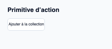
// Public label overrides localize this fixture; toolkit/host defaults keep their language.
// SPDX-License-Identifier: GPL-3.0-or-later
import { KitPressable, KitTheme, KitThemes } from "@kit/kit.slint";

export component Example inherits Window {
    title: "KitPressable — exemple";
    preferred-width: 360px;
    preferred-height: 160px;
    max-width: 100000px;
    max-height: 100000px;
    background: root.theme.canvas;
    in-out property <KitTheme> theme: KitThemes.light;
    in-out property <string> status;
    VerticalLayout {
        padding: 24px; spacing: 16px; alignment: start;
        Text { text: "Primitive d’action"; color: root.theme.text-primary; font-size: 20px * root.theme.text-scale; font-weight: 600; }
        KitPressable { theme: root.theme; accessible-name: "Ajouter à la collection"; activated => { root.status = "Ajouté à la collection"; } Text { text: "Ajouter à la collection"; color: root.theme.text-primary; horizontal-alignment: center; vertical-alignment: center; } }
        if root.status != "": Text { text: root.status; color: root.theme.text-secondary; font-size: 12px * root.theme.text-scale; wrap: word-wrap; }
    }
}
API publique
Hérite de Rectangle.
Propriétés
| Nom | Type | Sens |
|---|---|---|
theme |
KitTheme |
in |
intent |
ButtonIntent |
in |
control-size |
ControlSize |
in |
control-width |
ControlWidth |
in |
recipe |
ButtonRecipe |
in |
accessible-name |
string |
in |
disabled |
bool |
in |
busy |
bool |
in |
tab-stop |
bool |
in |
hovered |
bool |
out |
pressed |
bool |
out |
has-focus |
bool |
out |
focus-visible |
bool |
out |
Types et variantes
| Type | Déclaration |
|---|---|
enum ButtonIntent |
primary, secondary, quiet, destructive |
enum ControlSize |
compact, medium, comfortable |
enum ControlWidth |
intrinsic, fill |
Signaux
activated()activation-started()key-event(event: KeyEvent) → EventResultfocus-observed(bool)
Fonctions
cancel-press()take-focus()